Plotting using ggplot
Introduction
Each chart built with ggplot2 must include the following:
- Data
- Aesthetic mapping (aes)
- Geometric objects (geom)
Thus, the template for graphic in ggplot2 is:
<DATA> %>%
    ggplot(aes(<MAPPINGS>)) +
    <GEOM_FUNCTION>()
Data Prep
library(tidyverse)
library(here)

data <-
  read_csv(here("data/SAFI_clean.csv"), na = "NULL") %>%
    separate_longer_delim(items_owned, delim = ";") %>%
    mutate(value = 1) %>%
    pivot_wider(names_from = items_owned,
                values_from = value,
                names_glue = "owns_{items_owned}",
                values_fill = 0) %>%
    rowwise %>%
    select(-"owns_NA") %>%
    mutate(number_items = sum(c_across(starts_with("owns_"))))
Scatter plot
A scatter plot uses geom_point()

To differentiate overlapping points, you can use transparency…
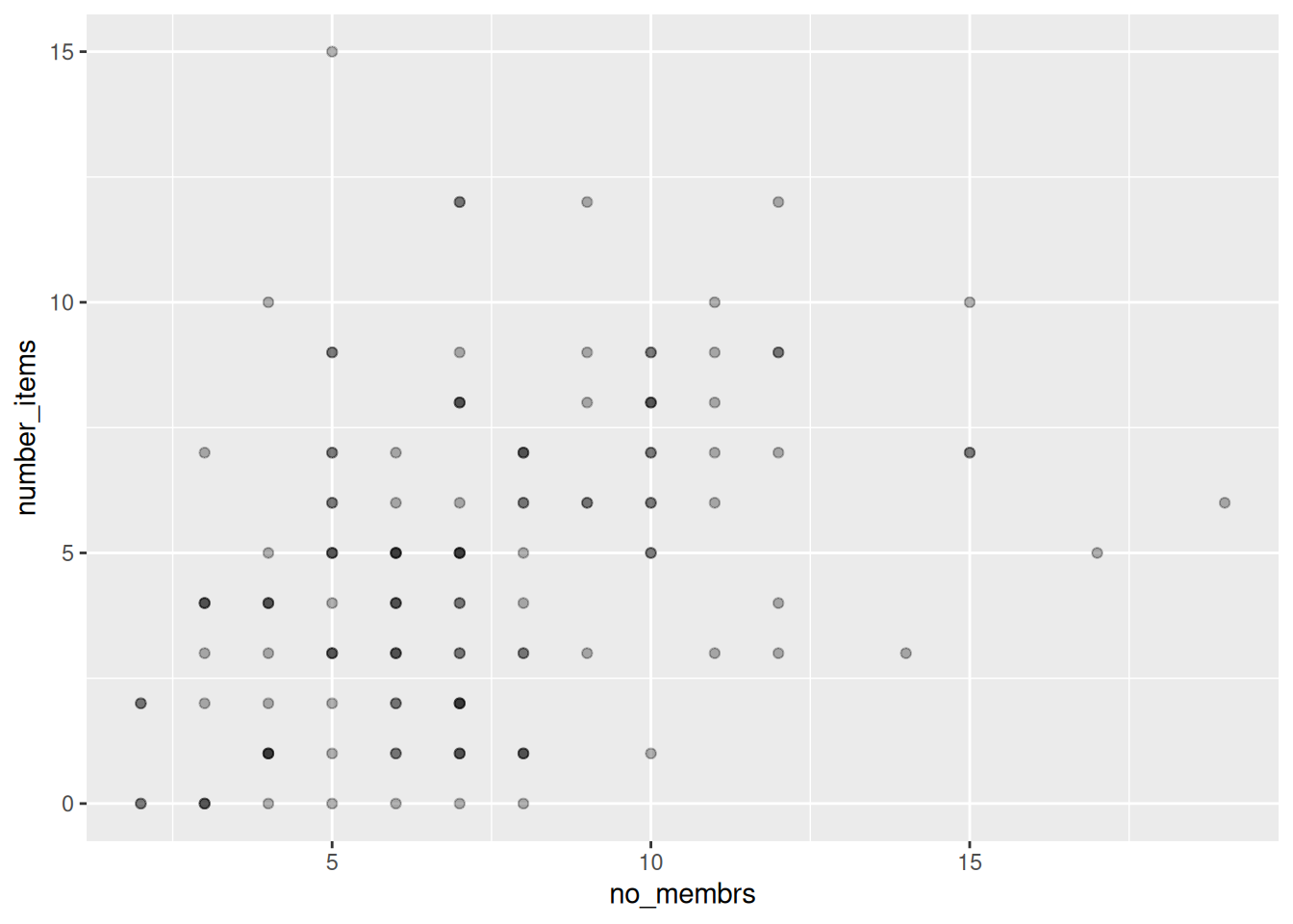
…or add jitter:

To add groups, add the variable that defines the groups as an aesthetic mapping, either
in the call to ggplot(), or the one in the geom_() function you use:

Boxplot
data %>%
    ggplot(aes(x = respondent_wall_type, y = rooms)) +
    geom_boxplot(alpha = 0) +
    geom_jitter(alpha = 0.3,
                color = "tomato",
                width = 0.2,
                height = 0.2)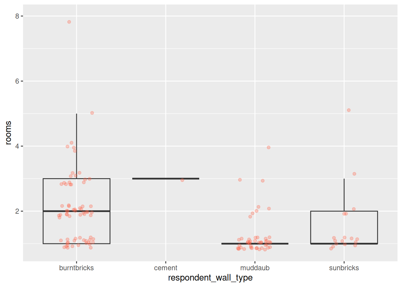
Bar chart
For a simple bar chart of counts:
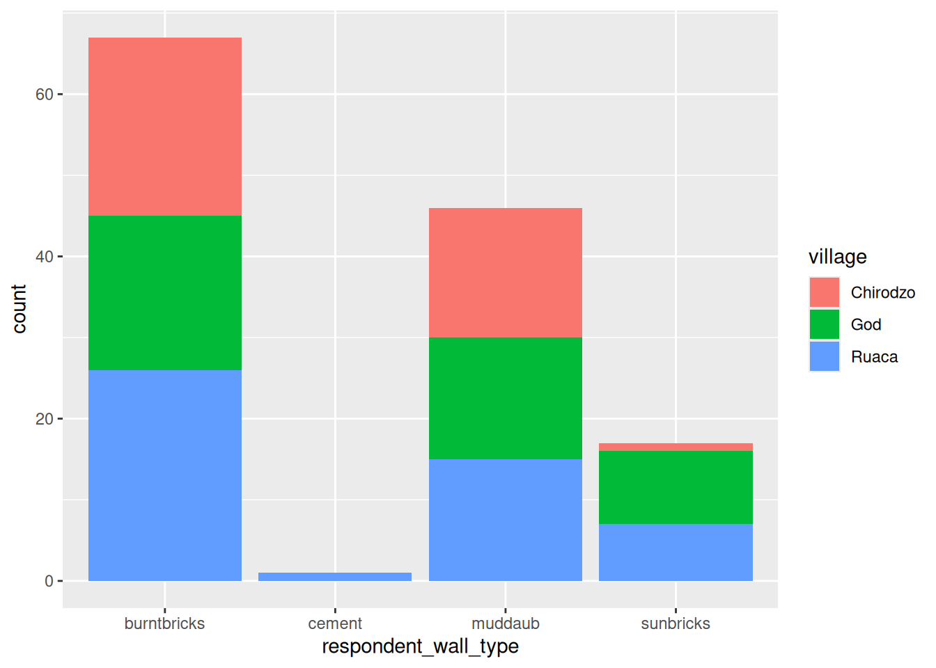
And since stacked bar charts are not easy to read:
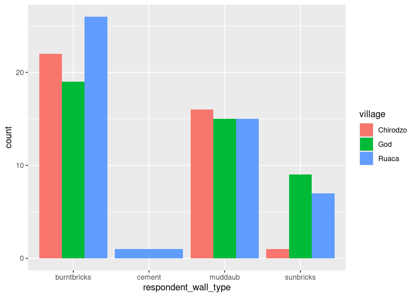
Note that geom_bar() defaults to displaying counts. If you want something else, you can
use the stat = option. stat = "identity" is especially useful, as it displays values as-is,
allowing you to pre-process your data anyway you want, for example to get percentages:
wall_plot <-
  data %>%
  filter(respondent_wall_type != "cement") %>%
  group_by(village, respondent_wall_type) %>%
  summarize(n = n()) %>%
  mutate(percent = (n / sum(n)) * 100) %>%
  ungroup() %>%
  ggplot(aes(x = village, y = percent, fill = respondent_wall_type)) +
    geom_bar(stat = "identity", position = "dodge")

wall_plot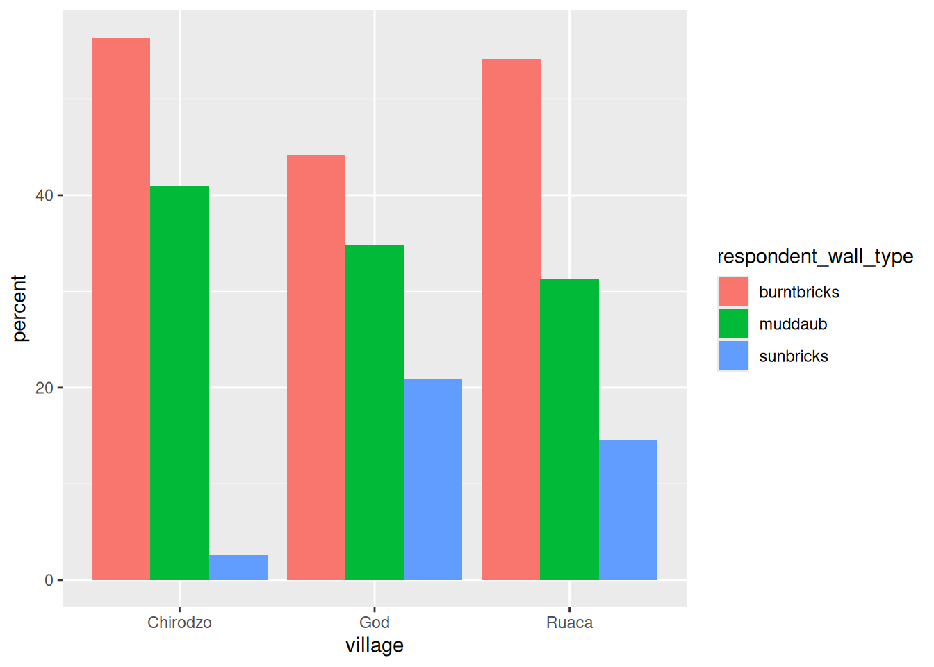
Labels
The labs() function changes labels, the scale_ family of functions change axes and legends:
wall_plot +
    labs(title = "Proportion of wall type by village",
         fill = "Type of Wall in Home",
         x = "Village",
         y = "Percent") +
    scale_fill_discrete(labels=c('Burned briks', 'Mud Daub', 'Sun Bricks')) +
    scale_y_continuous(limits= c(0,100), n.breaks = 6)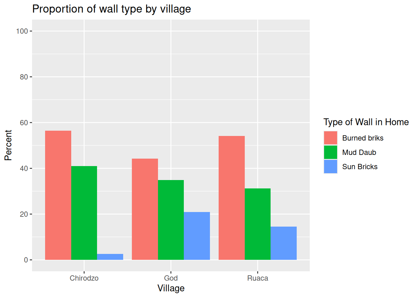
Faceting
Faceting allows splitting a graph in multiple parts:
data %>%
    group_by(village) %>%
    summarize(across(.cols = starts_with("owns_"),
                     .fns = ~sum(.x,na.rm=TRUE) / n() * 100,
                     .names = "{str_replace(.col, 'owns_', '')}")) %>%
    pivot_longer(-village, names_to = "items", values_to = "percent") %>%
    ggplot(aes(x = village, y = percent)) +
        geom_bar(stat = "identity", position = "dodge") +
        facet_wrap(~ items) +
        theme_bw() +
        theme(panel.grid = element_blank())
Note that the .names argument to summarize(across()) is specified as a
glue string that uses str_replace() to cut off the "owns_"
bit of the column names.
Stacked bar chart with WUR template and observation counts
First, download the WUR template from here. Install it following the instruction on that page.
Then we make a stacked bar chart using position = position_fill().
I use reverse = TRUE because I think the ordering doesn’t make
sense in these horizontal plots.
library(ggthemewur)

data %>%
ggplot(aes(y = village, fill = respondent_wall_type)) +
  geom_bar(position = position_fill(reverse = TRUE))  +
  theme_wur() +
  scale_fill_wur_discrete() +
  scale_x_continuous(labels = scales::percent_format())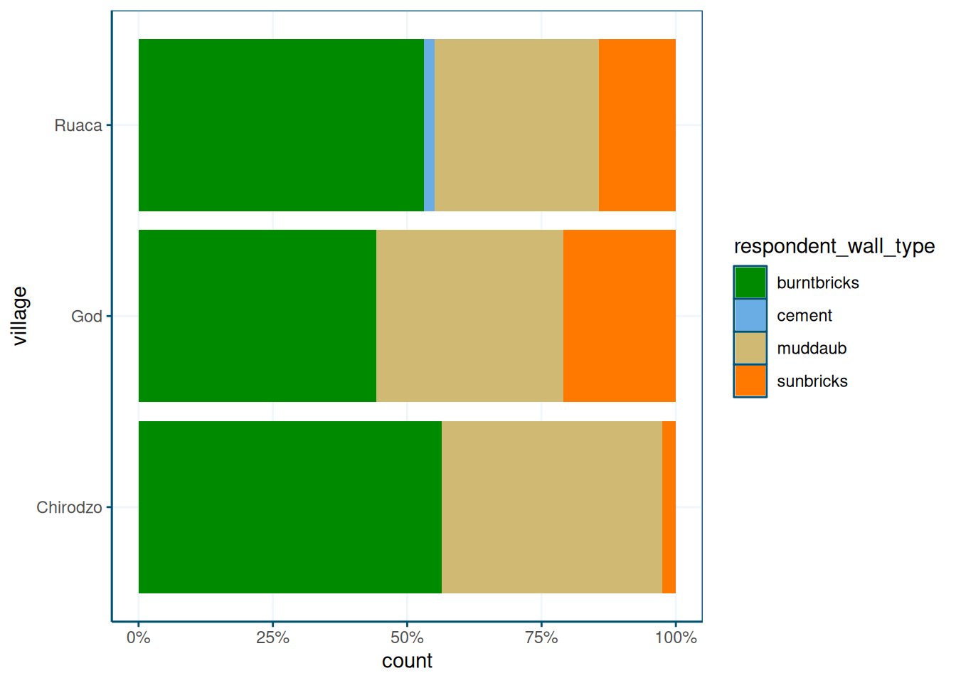
I like the percentages, but perhaps it’s good to know how many observations we have in each village. We can do this by changing the village names:
data %>%
  group_by(village) %>%
  add_count() %>%
  mutate(village = paste0(village," (n =",n,")")) %>%
  ggplot(aes(y = village, fill = respondent_wall_type)) +
  geom_bar(position = position_fill(reverse = TRUE))  +
  theme_wur() +
  scale_fill_wur_discrete() +
  scale_x_continuous(labels = scales::percent_format())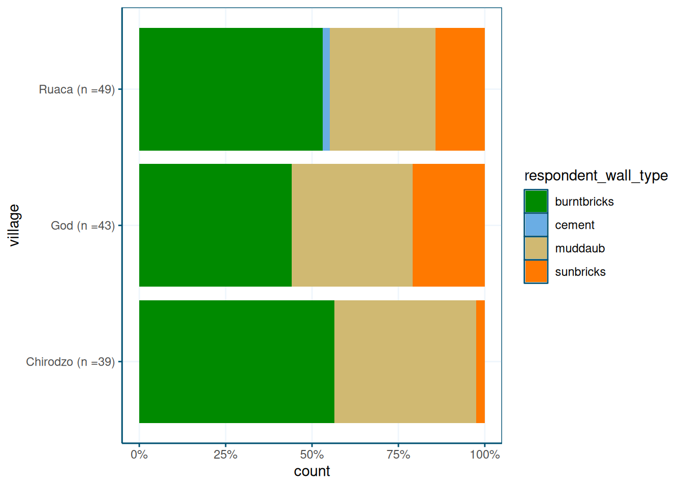
You can also put the counts inside the plot:
data %>%
  ggplot(aes(y = village, fill = respondent_wall_type)) +
  geom_bar(position = position_fill(reverse = TRUE))  +
  theme_wur() +
  scale_fill_wur_discrete() +
  scale_x_continuous(labels = scales::percent_format()) +
  geom_text(stat = "count",
            aes(label = after_stat(count)),
            position = position_fill(vjust = 0.5, reverse = TRUE),
color = "white") 
Or as percentages:
data %>%
  ggplot(aes(y = village, fill = respondent_wall_type)) +
  geom_bar(position = position_fill(reverse = TRUE))  +
  theme_wur() +
  scale_fill_wur_discrete() +
  scale_x_continuous(labels = scales::percent_format()) +
  geom_text(aes(label = after_stat(scales::percent(count / sum(count),accuracy=1))),
            stat = "count",
            position = position_fill(vjust = 0.5, reverse = TRUE),
color = "white") 
As a re-usable function
These plot specifications can get quite complicated; if you need to re-use it many times throughout a report, it is worth taking the time to convert them to a fucntion:
If you’re writing a report that includes the same type of plot in many places, it makes sense to make it into a function:
library(ggthemewur)

stacked_bar_plot <- function(df, by, fill) {
  # outputs a stacked bar chart

  df %>%
    mutate( {{ by }} := count_label( {{ by }})) %>%

    ggplot(aes(y = {{ by }}, fill = {{ fill }})) +
      geom_bar(position = position_fill(reverse = TRUE)) +
      labs(x= "") +
      theme_wur() +
      scale_fill_wur_discrete() +
       geom_text(stat = "count",
                 aes(label = after_stat(count)),
                 position = position_fill(vjust = 0.5, reverse = TRUE),
                 color = "white") +
      scale_x_continuous(labels = scales::percent_format()) +
      theme(legend.position="bottom") +
      guides(fill = guide_legend(nrow = 1,
                                 title.position="top",
                                 title.hjust = 0.5))
}

count_label <- function(vector) {
  # takes a vector of strings or factor,
  # output a factor vector with N = N included in the labels
  fct_recode(factor(vector),
             !!!vector %>%
               as_tibble() %>%
               group_by(value) %>%
               summarize(n = n()) %>%
               mutate(value = as.character(value),
                      newlabel = paste0(value,"\nn=",n)) %>%
               pull(value, name = newlabel))

}


read_csv(here("data/SAFI_clean.csv"), na = "NULL") %>%
  stacked_bar_plot(village,respondent_wall_type)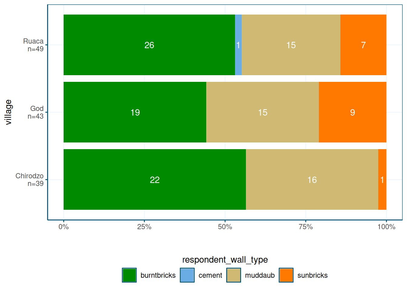
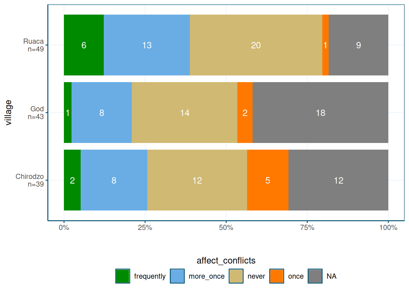
Note that the count_label() function adds group counts to factor variable labels.
This is useful for the by variable.
I am not sure if I understand what the !!! operator means, but it works.
The function basically creates a named vector, where the vector values are the old
factor labels, and the vector names are new factor labels.
The new labels include the N, which is computed using a
standard group_by() %>% summarize() pipeline.
Ordering of labels
By default, ggplot will order categorical variables in your graph alphatically.
With the wall types this was fine, but when the categories have an order, this
doesn’t look good:
data %>%
    ggplot(aes(y = village, fill = affect_conflicts)) +
        geom_bar(position = position_fill(reverse = TRUE))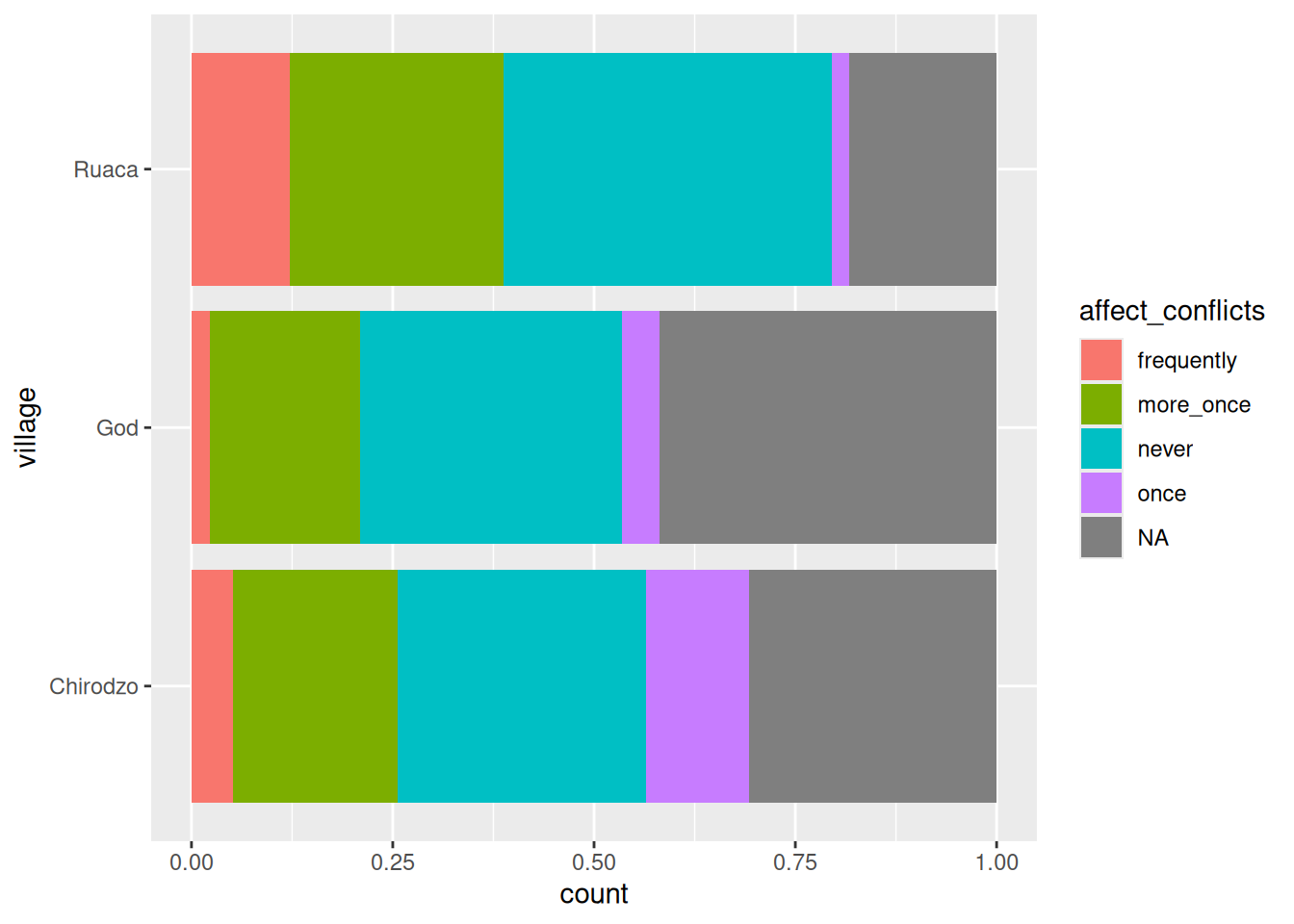
Here you’d expect the once category to be between more_once and never, not at the end.
To fix this, convert the variable to a factor.
The order in the levels argument will be the order in which the labels will be displayed:
data %>%
    mutate(affect_conflicts = factor(affect_conflicts, levels = c("frequently",
                                                                  "more_once",
                                                                  "once",
                                                                  "never"))) %>%
    ggplot(aes(y = village, fill = affect_conflicts)) +
geom_bar(position = position_fill(reverse = TRUE)) 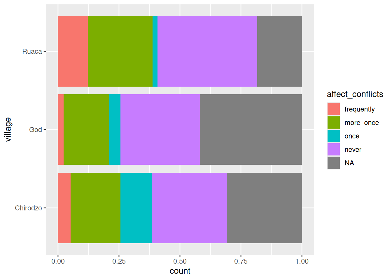
Note that the trick of adding group counts to string variables using add_count() doesn’t work with factors.
Or rather, it works, but converts the factor back to a string.
In the functions chapter, I define a function called count_label() that adds group counts
to factor variables using black magic.
Lollipop plot
A lollipop plot is a nice alternative to a bar chart. Here is an example.
It uses reorder to put the longest lollipops are at the top, and
and the brewur() function to select four colors from the WUR theme.
N = nrow(data)

read_csv(here("data/SAFI_clean.csv"), na = "NULL") %>%
    separate_longer_delim(items_owned, delim = ";") %>%
    select(items_owned) %>%
    filter(!is.na(items_owned)) %>%
    group_by(items_owned) %>%
    summarize(Count = n() / N) %>%
    mutate(items_owned = reorder(items_owned, Count)) %>%
    ggplot(aes(x = Count, y = items_owned)) +
        geom_linerange(aes(y = items_owned, xmin = 0, xmax = Count), color = "gray") +
        geom_point(aes(x = Count, y = items_owned),
                   size = 4, position = position_dodge(width = 0.5),
                   color = brewur()[[1]]) +
        theme_wur() +
        scale_x_continuous(labels = scales::percent_format())
You can of course also group things, but this may mess up the ordering.
Here I use complete to make sure that 0s ae properly displayed.
The trick is to use position = position_dodge(width = 0.5).
I use scale_color_manual() to set the colors to the first four WUR colors.
## # A tibble: 3 × 2
##   village      n
##   <chr>    <int>
## 1 Chirodzo    39
## 2 God         43
## 3 Ruaca 49read_csv(here("data/SAFI_clean.csv"), na = "NULL") %>%
# get list of items, and summarize to counts by village
separate_longer_delim(items_owned, delim = ";") %>%
select(village, items_owned) %>%
filter(!is.na(items_owned)) %>%
group_by(village, items_owned) %>%
summarize(Count = n()) %>%
# make sure 0s are explicit
ungroup() %>%
complete(village, items_owned, fill = list(Count = 0)) %>%
# merge in village totals
left_join(read_csv(here("data/SAFI_clean.csv"), na = "NULL") %>%
group_by(village) %>%
summarize(n = n())) %>%
# compute percentages
mutate(Percent = Count / n) %>%
mutate(items_owned = reorder(items_owned, Percent)) %>%
# plot
ggplot(aes(x = Percent, y = items_owned, group = village)) +
geom_linerange(aes(y = items_owned, xmin = 0, xmax = Percent),
position = position_dodge(width = 1), color = "gray") +
geom_point(aes(x = Percent, y = items_owned, color = village),
size = 4, position = position_dodge(width = 1)) +
scale_color_manual(values = brewur()[1:4]) +
theme_wur() +
scale_x_continuous(labels = scales::percent_format())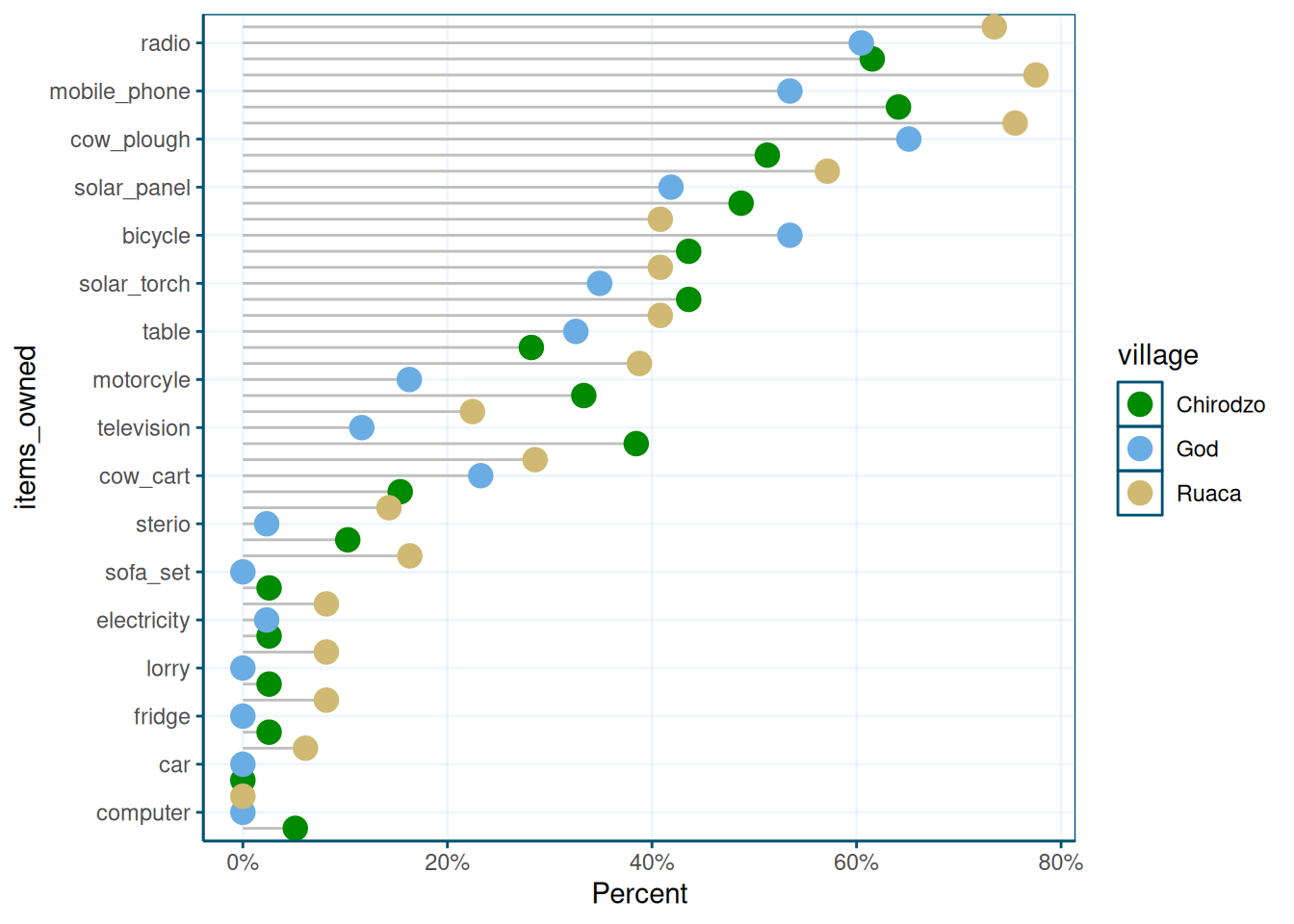
This graph is very crowded, so probably would need some changes. Perhaps facetting would have been better here, or you could manually tweak the y-values to create some whitespace.
Maps
For maps, we use the sf package, and a sample data set, in geo-json format (but sf can use
all sorts of shapefiles).
library(sf)

file <- "https://raw.githubusercontent.com/johan/world.geo.json/master/countries.geo.json"


shapefile <- st_read(file)
## Reading layer `countries.geo' from data source
## `https://raw.githubusercontent.com/johan/world.geo.json/master/countries.geo.json'
## using driver `GeoJSON'
## Simple feature collection with 180 features and 2 fields
## Geometry type: MULTIPOLYGON
## Dimension: XY
## Bounding box: xmin: -180 ymin: -85.60904 xmax: 180 ymax: 83.64513
## Geodetic CRS: WGS 84## Simple feature collection with 180 features and 2 fields
## Geometry type: MULTIPOLYGON
## Dimension: XY
## Bounding box: xmin: -180 ymin: -85.60904 xmax: 180 ymax: 83.64513
## Geodetic CRS: WGS 84
## First 10 features:
## id name geometry
## 1 AFG Afghanistan MULTIPOLYGON (((61.21082 35...
## 2 AGO Angola MULTIPOLYGON (((16.32653 -5...
## 3 ALB Albania MULTIPOLYGON (((20.59025 41...
## 4 ARE United Arab Emirates MULTIPOLYGON (((51.57952 24...
## 5 ARG Argentina MULTIPOLYGON (((-65.5 -55.2...
## 6 ARM Armenia MULTIPOLYGON (((43.58275 41...
## 7 ATA Antarctica MULTIPOLYGON (((-59.57209 -...
## 8 ATF French Southern and Antarctic Lands MULTIPOLYGON (((68.935 -48....
## 9 AUS Australia MULTIPOLYGON (((145.398 -40...
## 10 AUT Austria MULTIPOLYGON (((16.97967 48...You can use ggplot() and geom_sf() to make a map:
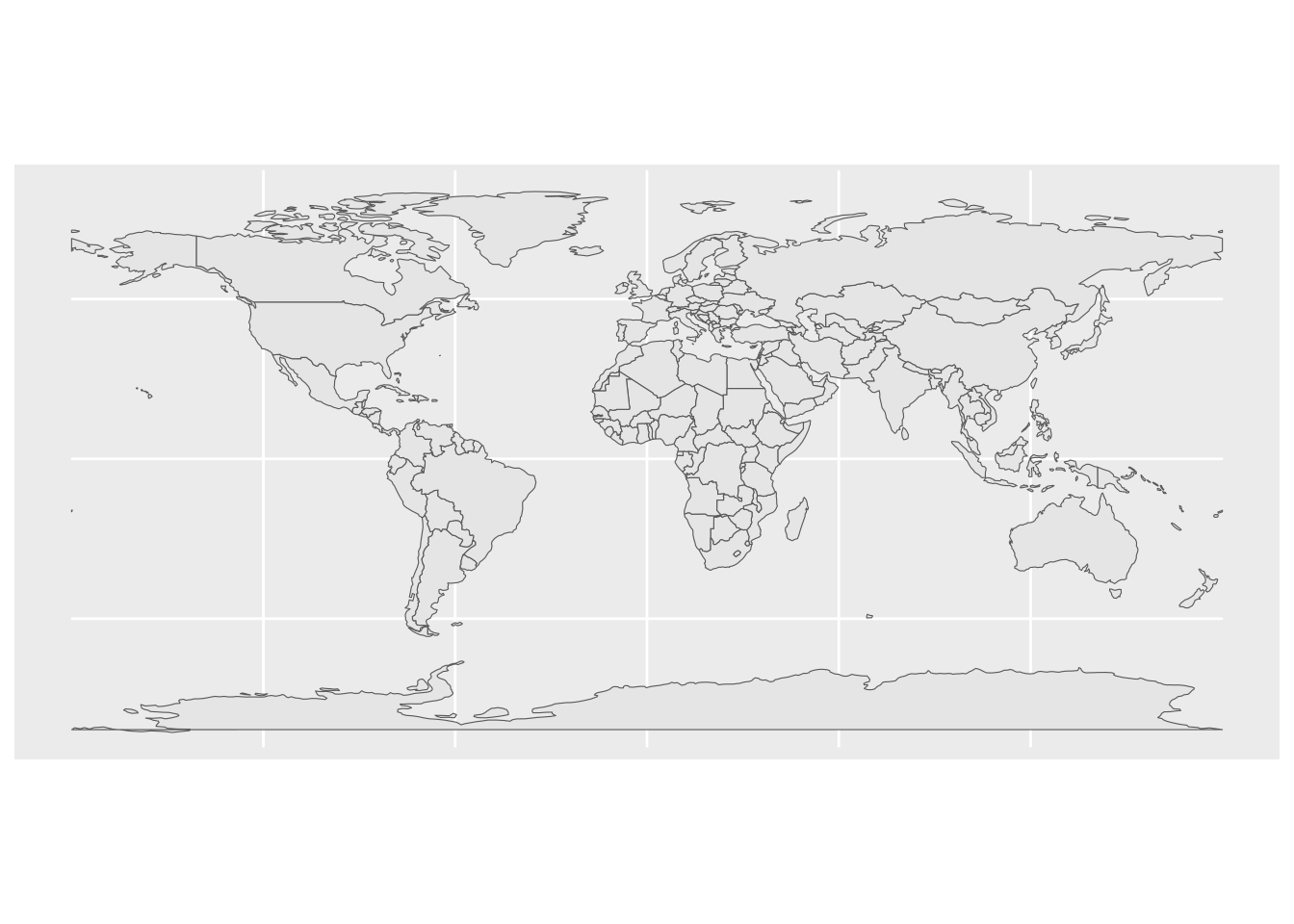
You can use the shapefile as a regular data file, using any old data wrangling functions on it.
## Simple feature collection with 180 features and 3 fields
## Geometry type: MULTIPOLYGON
## Dimension:     XY
## Bounding box:  xmin: -180 ymin: -85.60904 xmax: 180 ymax: 83.64513
## Geodetic CRS:  WGS 84
## First 10 features:
##     id                                name                       geometry
## 1  AFG                         Afghanistan MULTIPOLYGON (((61.21082 35...
## 2  AGO                              Angola MULTIPOLYGON (((16.32653 -5...
## 3  ALB                             Albania MULTIPOLYGON (((20.59025 41...
## 4  ARE                United Arab Emirates MULTIPOLYGON (((51.57952 24...
## 5  ARG                           Argentina MULTIPOLYGON (((-65.5 -55.2...
## 6  ARM                             Armenia MULTIPOLYGON (((43.58275 41...
## 7  ATA                          Antarctica MULTIPOLYGON (((-59.57209 -...
## 8  ATF French Southern and Antarctic Lands MULTIPOLYGON (((68.935 -48....
## 9  AUS                           Australia MULTIPOLYGON (((145.398 -40...
## 10 AUT                             Austria MULTIPOLYGON (((16.97967 48...
##             x
## 1   0.5503934
## 2  -1.1343310
## 3   1.4623515
## 4   0.7021167
## 5   2.5071111
## 6  -1.8900271
## 7  -0.5898128
## 8  -1.7145023
## 9  -0.4209979
## 10  0.3101414
You can use the fill aesthetic to color your shapefile:
shapefile_updated %>%
    ggplot(aes(fill = x)) +
        geom_sf(colour = NA) +  # removes borders
        theme_void()            # removes grid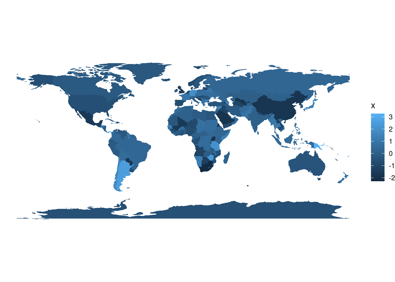
You can also make an interactive map, which you can use in html documents created with rmarkdown,
or in shiny applications. It uses a palette I created using the colorBin() function.
library(leaflet)


pallete <- colorBin(
  palette = "YlOrBr", domain = shapefile_updated$x,
  na.color = "transparent", bins = 5
)

shapefile %>%
    mutate(x = rnorm(n = nrow(.))) %>%
    leaflet() %>%
    addTiles() %>%
    addPolygons(fillColor = ~pallete(x),
                stroke = TRUE,
                fillOpacity = 0.9,
                color = "white",
                weight = 0.3) %>%
    addLegend(pal = pallete, values = ~x, opacity = 0.9,
              title = "Look at these pretty colours", position = "bottomleft")