5. Estimating and reporting
This chapter uses a large number of packages, and the SAFI data set, so make sure all are downloaded by running the code from the Set-up section.
I will create a table of descriptive statistics, and a simple regression table.
Generating some fake data
First we make a fake intervention aimed at improving fertilizer adoption. Adoption depends on the treatment and education and a random component. The page on DeclareDesign has more advanced techniques to generate fake data.
library(tidyverse)
library(here)
library(modelsummary)
library(flextable)
library(estimatr)
library(lmtest)
library(clubSandwich)

rm(list=ls())
set.seed(1)

data <-
  read_csv(here("data/SAFI_clean.csv"), na = "NULL") %>%
  left_join({.} %>%
            select(village) %>%
            distinct(village) %>%
            rowwise %>%
            mutate(treatment = rbinom(1,1,0.5)))%>%
  rowwise() %>%
  mutate(educated = rbinom(1,1,0.3),
         u = sample(c(0.1,0.2,0.3),1),
         prob = 0.3 * treatment + 0.1 * educated + u,
         uses_fertilizer = rbinom(1,1,prob)) %>%
  ungroup() %>%
  select(-prob,-u)
Making a table of summary statistics
Using modelsummary and flextable
The modelsummary package is the most convenient to create tables. To convert them
to word, I use the flextable package.
For a simple table of descriptive statistics, use the datasummary() function. I also
define a vector with variable labels, which I use throughout this chapter. Below, I use
it in the labelizor() function, which applies labels to a flextable object. I also
apply the autofit() and fix_border_issues() functions to make the table look nicer.
library(modelsummary)
library(flextable)

# vector for labelling variable names
labels = c(no_membrs = "# HH Members",
           years_liv = "Year in village",
           rooms = "# Rooms",
           liv_count = "# Livestock",
           no_meals = "# Meals",
           treatment = "Treated",
           educated = "Educated",
           uses_fertilizer = "Uses fertilizer",
           `(Intercept)` = "Constant")

# descriptive stats
data %>%
  select(where(is.numeric), -ends_with("ID")) %>%
  datasummary(All(.) ~ Mean + SD + min + max + Histogram , data = ., output = "flextable") %>%
  labelizor(j =1,labels = labels, part = "all")%>%
  fix_border_issues() %>%
  autofit()
| Mean | SD | min | max | Histogram |
|---|---|---|---|---|---|
# HH Members | 7.19 | 3.17 | 2.00 | 19.00 | ▂▅▇▂▃▂▁ |
Year in village | 23.05 | 16.91 | 1.00 | 96.00 | ▆▇▆▁▂▁ |
# Rooms | 1.74 | 1.09 | 1.00 | 8.00 | ▇▃▂ |
# Livestock | 2.37 | 1.08 | 1.00 | 5.00 | ▆▅▇▂ |
# Meals | 2.60 | 0.49 | 2.00 | 3.00 | ▅▇ |
Treated | 0.37 | 0.49 | 0.00 | 1.00 | ▇▄ |
Educated | 0.30 | 0.46 | 0.00 | 1.00 | ▇▃ |
Uses fertilizer | 0.34 | 0.48 | 0.00 | 1.00 | ▇▄ |
Flextables can be easily exported to Word using the save_as_docx() function.
Balance Table
Using modelsummary’s datasummary_balance() table function, it is easy
to create a balance table:
treat_labels <- c("0" = "Control", "1" = "Treated")

# balance table
data %>%
  select(where(is.numeric), -ends_with("ID")) %>%
  datasummary_balance( ~ treatment , data = .,
                      output = "flextable", stars = TRUE,
                      dinm = TRUE, dinm_statistic = "p.value") %>%
  labelizor(j =1,labels = labels, part = "all")%>%
  labelizor(labels = treat_labels, part = "header")%>%
  fix_border_issues() %>%
  autofit()
| Control | Treated |
| |||
|---|---|---|---|---|---|---|
| Mean | Std. Dev. | Mean | Std. Dev. | Diff. in Means | p |
# HH Members | 7.0 | 2.9 | 7.6 | 3.6 | 0.6 | 0.320 |
Year in village | 21.9 | 14.9 | 24.9 | 19.8 | 3.0 | 0.366 |
# Rooms | 1.7 | 1.2 | 1.7 | 1.0 | -0.0 | 0.961 |
# Livestock | 2.2 | 1.0 | 2.6 | 1.2 | 0.3 | 0.107 |
# Meals | 2.6 | 0.5 | 2.6 | 0.5 | 0.0 | 0.594 |
Educated | 0.3 | 0.5 | 0.3 | 0.5 | 0.0 | 0.873 |
Uses fertilizer | 0.2 | 0.4 | 0.5 | 0.5 | 0.3** | 0.003 |
Advanced: Using only Flextable
For more control, the flextable package can convert data frames into good-looking tables using the
tabulator() function.
First, make a data frame with summary statistics.
I duplicate the data set using bind_rows() to create an overall group.
Then I use
summarize(across(...))
to apply summarizing functionsto a number of variables.
summstats <-
  bind_rows(data %>%
              mutate(Treatment = ifelse(treatment,
                                        " Treatment",
                                        "  Control")),
            data %>%
              mutate(Treatment = "Overall")) %>%
  mutate(Treatment = factor(Treatment)) %>%
  select(where(is.numeric),Treatment,-key_ID,-treatment) %>%
  group_by(Treatment) %>%
  summarize(across(.cols = everything(),
                   .fns = list(n =  ~sum(!is.na(.x)),
                               nmiss =  ~sum(is.na(.x)),
                               mean = ~mean(.x,na.rm=TRUE),
                               sd = ~sd(.x,na.rm=TRUE),
                               min =  ~min(.x,na.rm=TRUE),
                               max =  ~max(.x,na.rm=TRUE),
                               iqr =  ~IQR(.x,na.rm=TRUE)),
                      .names =  "{.col}-{.fn}")) %>%
  pivot_longer(cols = -Treatment,
                 names_to = c("Variable",".value"),
                 names_sep="-")


summstats
## # A tibble: 21 × 9
## Treatment Variable n nmiss mean sd min max iqr
## <fct> <chr> <int> <int> <dbl> <dbl> <dbl> <dbl> <dbl>
## 1 " Control" no_membrs 82 0 6.96 2.86 2 15 3.75
## 2 " Control" years_liv 82 0 21.9 14.9 1 70 13.8
## 3 " Control" rooms 82 0 1.74 1.17 1 8 1
## 4 " Control" liv_count 82 0 2.24 1.01 1 4 2
## 5 " Control" no_meals 82 0 2.59 0.496 2 3 1
## 6 " Control" educated 82 0 0.293 0.458 0 1 1
## 7 " Control" uses_fertilizer 82 0 0.244 0.432 0 1 0
## 8 " Treatment" no_membrs 49 0 7.57 3.64 2 19 5
## 9 " Treatment" years_liv 49 0 24.9 19.8 2 96 22
## 10 " Treatment" rooms 49 0 1.73 0.953 1 4 1
## # ℹ 11 more rowsThen use I flextable’s tabulator() to make output that looks good in word.
Note that tabulator() sorts the columns alphabetically,
so that would be control - overall - treatment.
That doesn’t make sense,
so I have used spaces (" Treatment") to control the ordering.
I’ve added a bunch of statistics to show the flexibility:
library(flextable)

summstats %>%
  tabulator(rows = "Variable",
          columns = "Treatment",
          `N` = as_paragraph(as_chunk(n,digits=0)),
          `Mean (SD)` =  as_paragraph(as_chunk(fmt_avg_dev(mean,
                                      sd, digit1=2,digit2 = 2))),
          Range = as_paragraph(as_chunk(min,digits=3), "-",as_chunk(max,digits=3)) ) %>%
  as_flextable()
Variable | Control | Treatment | Overall | |||||||||
|---|---|---|---|---|---|---|---|---|---|---|---|---|
N | Mean (SD) | Range | N | Mean (SD) | Range | N | Mean (SD) | Range | ||||
educated | 82 | 0.29 (0.46) | 0.000-1.000 | 49 | 0.31 (0.47) | 0.000-1.000 | 131 | 0.30 (0.46) | 0.000-1.000 | |||
liv_count | 82 | 2.24 (1.01) | 1.000-4.000 | 49 | 2.57 (1.17) | 1.000-5.000 | 131 | 2.37 (1.08) | 1.000-5.000 | |||
no_meals | 82 | 2.59 (0.50) | 2.000-3.000 | 49 | 2.63 (0.49) | 2.000-3.000 | 131 | 2.60 (0.49) | 2.000-3.000 | |||
no_membrs | 82 | 6.96 (2.86) | 2.000-15.000 | 49 | 7.57 (3.64) | 2.000-19.000 | 131 | 7.19 (3.17) | 2.000-19.000 | |||
rooms | 82 | 1.74 (1.17) | 1.000-8.000 | 49 | 1.73 (0.95) | 1.000-4.000 | 131 | 1.74 (1.09) | 1.000-8.000 | |||
uses_fertilizer | 82 | 0.24 (0.43) | 0.000-1.000 | 49 | 0.51 (0.51) | 0.000-1.000 | 131 | 0.34 (0.48) | 0.000-1.000 | |||
years_liv | 82 | 21.94 (14.92) | 1.000-70.000 | 49 | 24.92 (19.83) | 2.000-96.000 | 131 | 23.05 (16.91) | 1.000-96.000 | |||
To add a column with differences, I first define a
function to compute the differences (I use a regression
rather than a ttest, so I can cluster my standard errors etc. to this if
I need to).
Then I use
summarize(across(...))
in much the same way as above, now to create a dataframe called difcol.
library(estimatr)

get_diffs <- function(equation, clusters = NULL, weights = NULL, std.error = FALSE){

  reg <-
    lm_robust(equation, clusters = {{ clusters }}, weights = {{ weights }}) %>%
    broom::tidy()

  estimate <- round(reg[2,2],2)

  p <- reg[2,5]

  stars = case_when(p < 0.001 ~ "***",
                    p < 0.01 ~ "**",
                    p < 0.05 ~ "*",
                    .default = "" )

    paste0(estimate,stars)

}

difcol <-
  data %>%
  select(where(is.numeric),-key_ID,treatment,village) %>%
  summarize(across(.cols = c(everything(), -treatment, -village),
                   .fns = ~get_diffs(.x ~ treatment, clusters = village))) %>%
  pivot_longer(cols =everything(),
               names_to = "Variable",
               values_to="Difference")
Then, all I have to do is add it to tabulator() using its datasup_last
argument. Below, I also use a few other flextable function to make the
table nicer. In particular, labelizor() to add variable
labels, for which I use the named vector I defined above.
descriptive_table_flex <-
  summstats %>%
  tabulator(rows = "Variable",
            columns = "Treatment",
            datasup_last = difcol,
            `N` = as_paragraph(as_chunk(n,digits=0)),
            `Mean (SD)` =  as_paragraph(as_chunk(fmt_avg_dev(mean, sd, digit1=2,digit2 = 2)))) %>%
  as_flextable()  %>%
  labelizor(j = "Variable", labels = labels, part = "body") %>%
  fix_border_issues() %>%
  autofit()

descriptive_table_flex
Variable | Control | Treatment | Overall | Difference | |||||||
|---|---|---|---|---|---|---|---|---|---|---|---|
N | Mean (SD) | N | Mean (SD) | N | Mean (SD) | ||||||
Educated | 82 | 0.29 (0.46) | 49 | 0.31 (0.47) | 131 | 0.30 (0.46) | 0.01 | ||||
# Livestock | 82 | 2.24 (1.01) | 49 | 2.57 (1.17) | 131 | 2.37 (1.08) | 0.33* | ||||
# Meals | 82 | 2.59 (0.50) | 49 | 2.63 (0.49) | 131 | 2.60 (0.49) | 0.05 | ||||
# HH Members | 82 | 6.96 (2.86) | 49 | 7.57 (3.64) | 131 | 7.19 (3.17) | 0.61 | ||||
# Rooms | 82 | 1.74 (1.17) | 49 | 1.73 (0.95) | 131 | 1.74 (1.09) | -0.01 | ||||
Uses fertilizer | 82 | 0.24 (0.43) | 49 | 0.51 (0.51) | 131 | 0.34 (0.48) | 0.27 | ||||
Year in village | 82 | 21.94 (14.92) | 49 | 24.92 (19.83) | 131 | 23.05 (16.91) | 2.98 | ||||
Again, to save it as a word file, use
save_as_docx(path = "my/file.docx").
Regression Tables
Simple regression
A simple regression uses the lm() function. I use the modelsummary()
function to display it:
lm <- lm(uses_fertilizer ~ treatment + educated, data = data)
modelsummary(lm, output = "flextable")
| (1) |
|---|---|
(Intercept) | 0.207 |
(0.057) | |
treatment | 0.265 |
(0.083) | |
educated | 0.128 |
(0.088) | |
Num.Obs. | 131 |
R2 | 0.089 |
R2 Adj. | 0.074 |
AIC | 172.5 |
BIC | 184.0 |
Log.Lik. | -82.241 |
F | 6.230 |
RMSE | 0.45 |
Robust standard errors, and custom glance methods
To get robust standard errors clustered at the village
level, using the same procedures Stata uses, I use
lm_robust():
library(estimatr)
lmrobust <-
  lm_robust(uses_fertilizer ~ treatment + educated,
            data = data, clusters = village, se_type = "stata")


modelsummary(list("LM" = lm, "Robust" = lmrobust), output = "flextable")
| LM | Robust |
|---|---|---|
(Intercept) | 0.207 | 0.207 |
(0.057) | (0.068) | |
treatment | 0.265 | 0.265 |
(0.083) | (0.091) | |
educated | 0.128 | 0.128 |
(0.088) | (0.097) | |
Num.Obs. | 131 | 131 |
R2 | 0.089 | 0.089 |
R2 Adj. | 0.074 | 0.074 |
AIC | 172.5 | 172.5 |
BIC | 184.0 | 184.0 |
Log.Lik. | -82.241 | |
F | 6.230 | |
RMSE | 0.45 | 0.45 |
Std.Errors | by: village |
I’d like to have just the N, r-squared and Adjusted R-squared, and a row indicating SEs are clustered or not:
# define a custom row to denote clustered SEs
custom_row <- tribble(
  ~term, ~LM, ~Robust,
  "Clustered SEs", "No", "Yes"
)

# choose what goodness-of-fit statistics to show using gof_map,
# and add the custom row using add_rows
modelsummary(list("LM" = lm, "Robust" = lmrobust),
             gof_map = c("nobs","r.squared","adj.r.squared"),
             add_rows = custom_row,
             output = "flextable") %>%
  autofit()
| LM | Robust |
|---|---|---|
(Intercept) | 0.207 | 0.207 |
(0.057) | (0.068) | |
treatment | 0.265 | 0.265 |
(0.083) | (0.091) | |
educated | 0.128 | 0.128 |
(0.088) | (0.097) | |
Num.Obs. | 131 | 131 |
R2 | 0.089 | 0.089 |
R2 Adj. | 0.074 | 0.074 |
Clustered SEs | No | Yes |
If you want to add the number of clusters,
you can do so manually, using add_row,
but you can also spend a lot of time getting R to do if for you,
which would save you the few seconds it would take to add it manually!
But really, having R do it does make for more reproducible code,
so that’s what we’ll do here.
modelsummary() gets the N etc. from the
broom::glance()
function:
##    r.squared adj.r.squared statistic    p.value df.residual nobs se_type
## 1 0.08871322    0.07447437   27.5137 0.03507086           2  131   stata
As you can see, this doesn’t report the number of
clusters,
but it is actually saved in the lm_robust() object:
## [1] 3Fortunately, modelsummary accepts custom methods,
so we make a ones for lm and `lm_robust objects
and add information about the clustering:
# the custom methods checks if there's a nclusters attribute,
# and if so, adds it to the glance output
glance_custom.lm <- function(x) {
  # this function takes glance() output, and adds a nclusters column
  glance(x) %>%
    mutate(nclusters = ifelse(!is.null(x$nclusters), x$nclusters, NA_integer_),
           clustered = ifelse(!is.null(x$nclusters), "Yes", "No"))
}


# the custom methods checks if there's a nclusters attribute,
# and if so, adds it to the glance output
glance_custom.lm_robust <- function(x) {
  # this function takes glance() output, and adds a nclusters column
  glance(x) %>%
    mutate(nclusters = ifelse(!is.null(x$nclusters), x$nclusters, NA_integer_),
           clustered = ifelse(!is.null(x$nclusters), "Yes", "No"))
}

# define a custom gof_map to control order and display of statistics
gof_map_custom <- tribble(
  ~raw, ~clean, ~fmt,
  "nobs", "N", 0,
  "r.squared", "R²", 2,
  "adj.r.squared", "Adj. R²", 2,
  "clustered", "Clustered SEs", 0,
  "nclusters", "Number of clusters", 0
)

modelsummary(list("LM" = lm, "Robust" = lmrobust),
             #add_rows = custom_row,
             gof_map = gof_map_custom,
             output = "flextable")
| LM | Robust |
|---|---|---|
(Intercept) | 0.207 | 0.207 |
(0.057) | (0.068) | |
treatment | 0.265 | 0.265 |
(0.083) | (0.091) | |
educated | 0.128 | 0.128 |
(0.088) | (0.097) | |
N | 131 | 131 |
R² | 0.09 | 0.09 |
Adj. R² | 0.07 | 0.07 |
Clustered SEs | No | Yes |
Number of clusters | 3 |
This was quite a bit more work than adding a custom row,
but more flexible, and will keep being correct even if we change the number of clusters.
Note that I also added a custom_gof_map to control the order and display of the
goodness-of-fit statistics.
Probit with cluster robust SEs
Now lets add a probit model!
probit <- glm(uses_fertilizer ~ treatment + educated,
                family = binomial(link = "probit"),
                data = data)

modelsummary(list("LM" = lm, "Robust" = lmrobust, "Probit"  = probit),
             gof_map = gof_map_custom,
             output = "flextable")
| LM | Robust | Probit |
|---|---|---|---|
(Intercept) | 0.207 | 0.207 | -0.813 |
(0.057) | (0.068) | (0.173) | |
treatment | 0.265 | 0.265 | 0.727 |
(0.083) | (0.091) | (0.236) | |
educated | 0.128 | 0.128 | 0.366 |
(0.088) | (0.097) | (0.250) | |
N | 131 | 131 | 131 |
R² | 0.09 | 0.09 | |
Adj. R² | 0.07 | 0.07 | |
Clustered SEs | No | Yes | No |
Number of clusters | 3 |
Adding cluster-robust standard errors to the probit model is a bit more
complex.
There is no glm_robust() function.
You can estimate a probit model,
then use the sandwich and lmtest packages to get clustered standard errors,
and then use the glance_custom method to add the number of clusters to that.
However,
you can create your own glm_robust function,
including tidy() and glance() methods that return everything
you want to modelsummary().
I use vcovCR from the clubSandwich package to compute CR2 standard errors,
which are the default in estimatr,
but there’s many different options for variance-covariance matrices,
and apapting the code to use them would be trivial.
# this function estimates a probit model, and
# then computes the cluster-robust standad errors using
# clubSandwich and coeftest
# it returns a glm_robust object, which is just a list with all the thing we may need.

glm_robust <- function(formula, family, data, cluster, type = "CR2") {

  # initialize the list we want to return
  out <- list()

  # Estimate model
  fit <- glm(formula, family = family, data = data)


  # we need the cluster variable from the observations used in the model:
  # first get the data used in the model (the complete observations),
  # and extract the row numbers
  row_numbers <-
    model.frame(fit) %>%
    rownames() %>%
    as.integer()

  # then use them to subset the original data and pull the cluster variable
  # The {{ }} syntax allows for unqouted variable names
  cluster_vec <-
    data %>%
    filter(row_number() %in% row_numbers) %>%
    pull( {{ cluster }} )

  # Cluster-robust VCOV
  vcov_cr <- clubSandwich::vcovCR(
    fit,
    cluster = cluster_vec,
    type = type
  )

  # populate are returned list:
  out$coef      <- lmtest::coeftest(fit, vcov. = vcov_cr)
  out$vcov      <- vcov_cr
  out$nclusters <- length(unique(cluster_vec))
  out$model     <- fit
  out$nobs      <- stats::nobs(fit)
  out$logLik    <- stats::logLik(fit)

  # set the class of my object: this controls what methods are used to extract info
  class(out) <- c("glm_robust")
  out
}

# this is the custom tidy methods for glm_robust objects
# it returns a dataframe with coefficients
tidy.glm_robust <- function(x, ...){

  tibble::tibble(
    term      = rownames(x$coef),
    estimate  = x$coef[, "Estimate"],
    std.error = x$coef[, "Std. Error"],
    statistic = x$coef[, "z value"],
    p.value   = x$coef[, "Pr(>|z|)"]
  )
}

# this is the glance method. It returns a data frame with
# the number of obserations, log likelihood and number of clusters
glance.glm_robust <- function(x, ...){
  tibble::tibble(
    nobs       = x$nobs,
    logLik     = as.numeric(x$logLik),
    nclusters  = x$nclusters,
    clustered = "Yes" #we only accept clustered SEs in this function, so we can just say "Yes"
  )
}
You can then simply use the glm_robust() function and modelsummary()
will know how to handle its output!
probitrobust <-
  glm_robust(uses_fertilizer ~ treatment + educated,
             family = binomial(link = "probit"),
             data = data,
             cluster = village,
             type = "CR2")


modelsummary(list("LM" = lm, "LM Robust" = lmrobust,
                  "Probit"  = probit, "Probit Robust" = probitrobust),
             gof_map = gof_map_custom,
             coef_map = labels,
             stars = TRUE,
             output = "flextable") %>%
  autofit()
| LM | LM Robust | Probit | Probit Robust |
|---|---|---|---|---|
Treated | 0.265** | 0.265** | 0.727** | 0.727* |
(0.083) | (0.091) | (0.236) | (0.331) | |
Educated | 0.128 | 0.128 | 0.366 | 0.366 |
(0.088) | (0.097) | (0.250) | (0.273) | |
Constant | 0.207*** | 0.207** | -0.813*** | -0.813** |
(0.057) | (0.068) | (0.173) | (0.279) | |
N | 131 | 131 | 131 | 131 |
R² | 0.09 | 0.09 | ||
Adj. R² | 0.07 | 0.07 | ||
Clustered SEs | No | Yes | No | Yes |
Number of clusters | 3 | 3 | ||
+ p < 0.1, * p < 0.05, ** p < 0.01, *** p < 0.001 | ||||
These functions would be quite easy to reuse in other projects!
Marginal Effects
To add marginal effects to your probit,
use the marginaleffects package.
THe avg_slopes() function computes average marginal effects.
Here I make a wrapper function (ame_robust()),
with a glance method that makes sure the number of clusters is reported
in modelsummary:
library(marginaleffects)

# wrapper function to make average marginal effects
ame_robust <- function(x) {

  ame <- marginaleffects::avg_slopes(
    x$model,
    vcov = x$vcov,
    type = "response"
  )

  out <- x
  out$coef <- ame

  class(out) <- "ame_robust"
  out
}

tidy.ame_robust <- function(x, ...){
 broom::tidy(x$coef) # ame object come with their own tidy method, so we can just use that
}

# glance methods for ame_robust objects
glance.ame_robust <- function(x, ...) {

  tibble::tibble(
    nobs       = x$nobs,
    logLik     = x$logLik,
    nclusters  = x$nclusters,
    clustered = "Yes" #we only accept clustered SEs in this function, so we can just say "Yes"
  )
}


modelsummary(list(LM = lmrobust, Probit = probitrobust,
                  "Marginal Effects" = ame_robust(probitrobust)),
             gof_map = gof_map_custom, coef_map = labels,
             stars = TRUE, output = "flextable")%>%
  autofit()
| LM | Probit | Marginal Effects |
|---|---|---|---|
Treated | 0.265** | 0.727* | 0.265* |
(0.091) | (0.331) | (0.106) | |
Educated | 0.128 | 0.366 | 0.129 |
(0.097) | (0.273) | (0.109) | |
Constant | 0.207** | -0.813** | |
(0.068) | (0.279) | ||
N | 131 | 131 | 131 |
R² | 0.09 | ||
Adj. R² | 0.07 | ||
Clustered SEs | Yes | Yes | Yes |
Number of clusters | 3 | 3 | 3 |
+ p < 0.1, * p < 0.05, ** p < 0.01, *** p < 0.001 | |||
Plots
To make plots, use ggplot2.
Plenty of help out there, here’s some examples, using the following data:
plot_data <-
  read_csv(here("data/SAFI_clean.csv"), na = "NULL") %>%
    separate_longer_delim(items_owned, delim = ";") %>%
    mutate(value = 1) %>%
    pivot_wider(names_from = items_owned,
                values_from = value,
                names_glue = "owns_{items_owned}",
                values_fill = 0) %>%
    rowwise %>%
    select(-"owns_NA") %>%
    mutate(number_items = sum(c_across(starts_with("owns_"))))
Faceting
Faceting allows splitting a graph in multiple parts:
plot_data %>%
    group_by(village) %>%
    summarize(across(.cols = starts_with("owns_"),
                     .fns = ~sum(.x,na.rm=TRUE) / n() * 100,
                     .names = "{str_replace(.col, 'owns_', '')}")) %>%
    pivot_longer(-village, names_to = "items", values_to = "percent") %>%
    ggplot(aes(x = village, y = percent)) +
        geom_bar(stat = "identity", position = "dodge") +
        facet_wrap(~ items) +
        theme_bw() +
        theme(panel.grid = element_blank())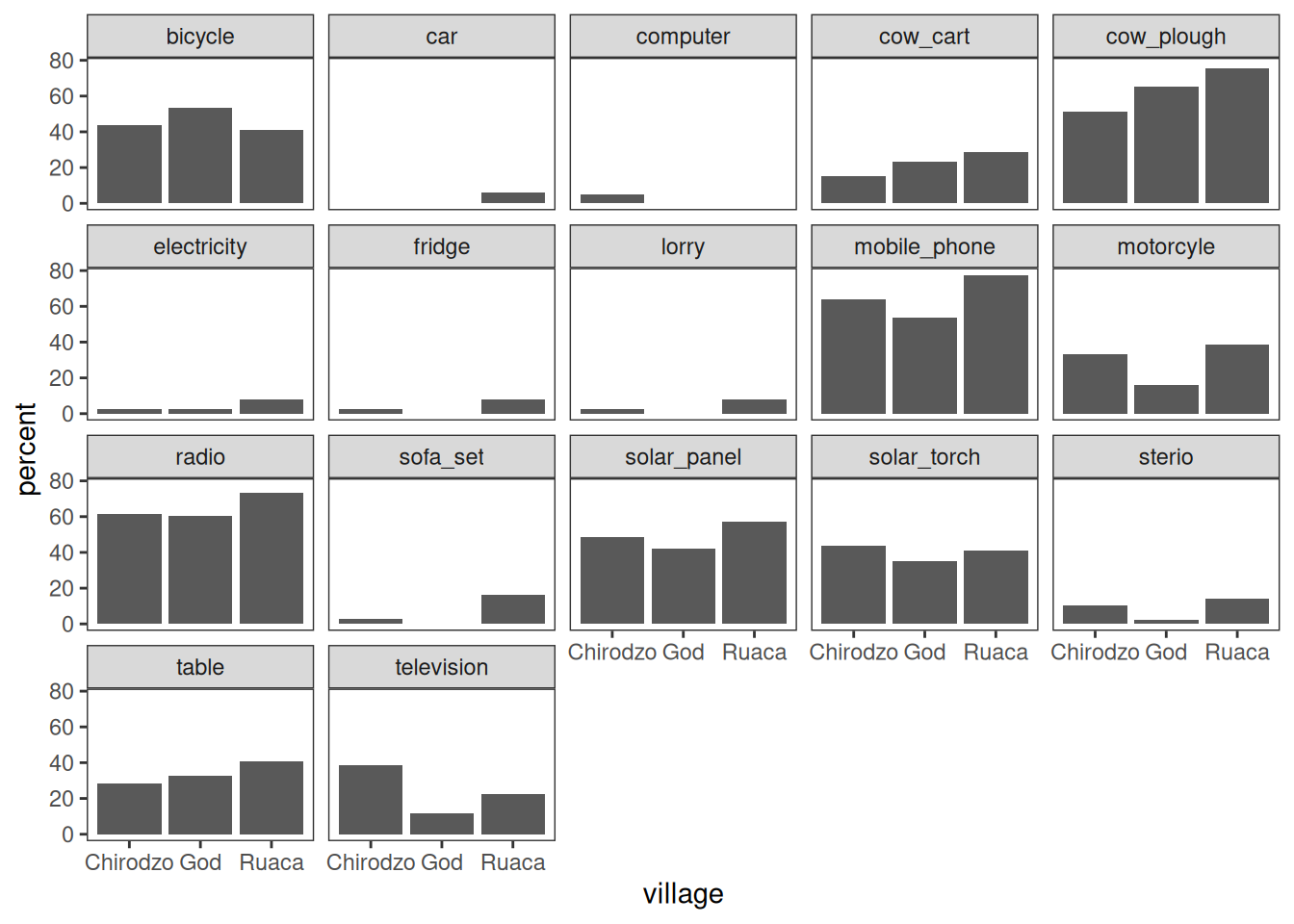
Note that the .names argument to summarize(across()) is specified as a
glue string that uses str_replace() to cut off the "owns_"
bit of the column names.
For more control, look into patchwork.
Stacked bar plots in WUR style
Stacked bar plots are useful to show distributions of categorical variables. Here is a function that makes a stacked bar plot, with percentages on the x-axis, counts inside the bars, and a legend at the bottom.
It uses a bunch of techniques:
- The wur household is applied using
[ggthemewur](https://git.wur.nl/wmrkdown/ggthemewur). - The plot is complex, but because it is contained in a reusable function, it is easy to (re-)use.
- Category counts are computed, and added to factor labels, using
count_label(). - Cell counts are extracted and displayed inside the bars, using
after_stat().
library(ggthemewur)

stacked_bar_plot <- function(df, by, fill) {
  # outputs a stacked bar chart

  df %>%
    # the category labels should include counts
    mutate( {{ by }} := count_label( {{ by }})) %>%
    ggplot(aes(y = {{ by }}, fill = {{ fill }})) +
    geom_bar(position = position_fill(reverse = TRUE)) +
    labs(x= "") +
    theme_wur() +
    scale_fill_wur_discrete() +
    geom_text(
      stat = "count",
      # for %: after_stat(scales::percent(count / sum(count),accuracy=1))
      aes(label = after_stat(count)),
      position = position_fill(vjust = 0.5, reverse = TRUE),
      color = "white"
    ) +
    scale_x_continuous(labels = scales::percent_format()) +
    theme(legend.position="bottom") +
    guides(
      fill = guide_legend(
        nrow = 1,
        title.position="top",
        title.hjust = 0.5
      )
    )
}

count_label <- function(vector) {
  # takes a vector of strings or factor,
  # output a factor vector with N = N included in the labels
  fct_recode(
    factor(vector),
    !!!vector %>%
      as_tibble() %>%
      group_by(value) %>%
      summarize(n = n()) %>%
      mutate(
        value = as.character(value),
        newlabel = paste0(value,"\nn=",n)
      ) %>%
    pull(value, name = newlabel)
  )

}


read_csv(here("data/SAFI_clean.csv"), na = "NULL") %>%
  stacked_bar_plot(village, respondent_wall_type)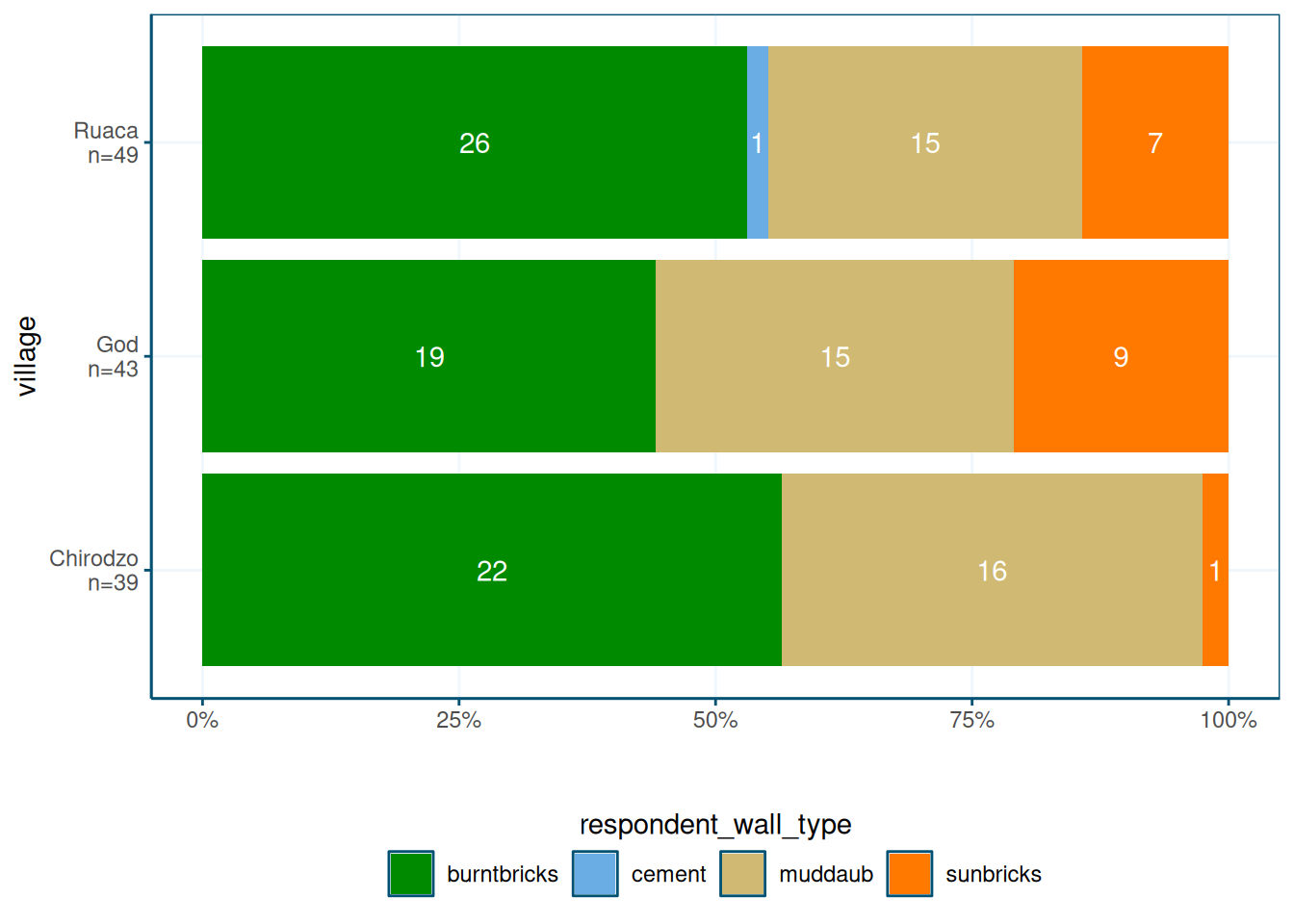
The point here is that plots can get quite complex, and by saving them in a function, you can reuse them easily.
Lollipop plot
A lollipop plot is a nice alternative to a bar chart. Here is an example.
It uses reorder to put the longest lollipops are at the top, and
and the brewur() function to select four colors from the WUR theme.
I also quite like theme_ipsum from hrbrthemes:
library(hrbrthemes)

N <- nrow(data)

read_csv(here("data/SAFI_clean.csv"), na = "NULL") %>%
    separate_longer_delim(items_owned, delim = ";") %>%
    select(items_owned) %>%
    filter(!is.na(items_owned)) %>%
    group_by(items_owned) %>%
    summarize(Count = n() / N) %>%
    mutate(items_owned = reorder(items_owned, Count)) %>%
    ggplot(aes(x = Count, y = items_owned)) +
    geom_linerange(
      aes(y = items_owned, xmin = 0, xmax = Count),
      color = "gray"
    ) +
    geom_point(
      aes(x = Count, y = items_owned),
      size = 4,
      position = position_dodge(width = 0.5),
      color = brewur()[[1]]
    ) +
    theme_ipsum() +
    scale_x_continuous(labels = scales::percent_format()) +
    labs(
      title = "Look at this graph",
      subtitle = "People love radios, phones, and a good plough")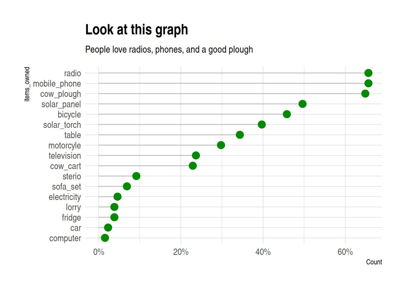
Maps
For maps, we use the sf package, and a sample data set, in geo-json format (but sf can use
all sorts of shapefiles).
I add some fake data to plot to the shapefile,
using familiar mutate() syntax:
library(sf)

file <- "https://raw.githubusercontent.com/johan/world.geo.json/master/countries.geo.json"


shapefile <-
  st_read(file) %>%
  mutate(x = rnorm(n = nrow(.)))
## Reading layer `countries.geo' from data source
## `https://raw.githubusercontent.com/johan/world.geo.json/master/countries.geo.json'
## using driver `GeoJSON'
## Simple feature collection with 180 features and 2 fields
## Geometry type: MULTIPOLYGON
## Dimension: XY
## Bounding box: xmin: -180 ymin: -85.60904 xmax: 180 ymax: 83.64513
## Geodetic CRS: WGS 84## Simple feature collection with 180 features and 3 fields
## Geometry type: MULTIPOLYGON
## Dimension: XY
## Bounding box: xmin: -180 ymin: -85.60904 xmax: 180 ymax: 83.64513
## Geodetic CRS: WGS 84
## First 10 features:
## id name geometry
## 1 AFG Afghanistan MULTIPOLYGON (((61.21082 35...
## 2 AGO Angola MULTIPOLYGON (((16.32653 -5...
## 3 ALB Albania MULTIPOLYGON (((20.59025 41...
## 4 ARE United Arab Emirates MULTIPOLYGON (((51.57952 24...
## 5 ARG Argentina MULTIPOLYGON (((-65.5 -55.2...
## 6 ARM Armenia MULTIPOLYGON (((43.58275 41...
## 7 ATA Antarctica MULTIPOLYGON (((-59.57209 -...
## 8 ATF French Southern and Antarctic Lands MULTIPOLYGON (((68.935 -48....
## 9 AUS Australia MULTIPOLYGON (((145.398 -40...
## 10 AUT Austria MULTIPOLYGON (((16.97967 48...
## x
## 1 -0.8874201
## 2 0.1054214
## 3 0.3528745
## 4 0.5503934
## 5 -1.1343310
## 6 1.4623515
## 7 0.7021167
## 8 2.5071111
## 9 -1.8900271
## 10 -0.5898128You can then use ggplot() and geom_sf() to make a map:
You can use the fill aesthetic to color your shapefile:
shapefile %>%
    ggplot(aes(fill = x)) +
        geom_sf(colour = NA) +  # removes borders
        theme_void()            # removes grid
You can also make an interactive map,
which you can use in html documents created with rmarkdown,
or in shiny applications. It uses a palette I created using the colorBin() function.
library(leaflet)


pallete <- colorBin(
  palette = "YlOrBr", domain = shapefile$x,
  na.color = "transparent", bins = 5
)

shapefile %>%
    #mutate(x = rnorm(n = nrow(.))) %>%
    leaflet() %>%
    addTiles() %>%
    addPolygons(fillColor = ~pallete(x),
                stroke = TRUE,
                fillOpacity = 0.9,
                color = "white",
                weight = 0.3) %>%
    addLegend(pal = pallete, values = ~x, opacity = 0.9,
              title = "Look at these pretty colours", position = "bottomleft")