6. Estimating and reporting
This chapter uses a large number of packages, and the SAFI data set, so make sure all are downloaded by running the code from the Set-up section.
I will create a table of descriptive statistics, and a simple regression table.
Generating some fake data
First we make a fake intervention aimed at improving fertilizer adoption. Adoption depends on the treatment and education and a random component. The page on DeclareDesign has more advanced techniques to generate fake data.
library(tidyverse)
library(here)
library(modelsummary)
library(flextable)
library(estimatr)
library(lmtest)
library(clubSandwich)

rm(list=ls())
set.seed(1)

data <-
  read_csv(here("data/SAFI_clean.csv"), na = "NULL") %>%
  left_join({.} %>%
            select(village) %>%
            distinct(village) %>%
            rowwise %>%
            mutate(treatment = rbinom(1,1,0.5)))%>%
  rowwise() %>%
  mutate(educated = rbinom(1,1,0.3),
         u = sample(c(0.1,0.2,0.3),1),
         prob = 0.3 * treatment + 0.1 * educated + u,
         uses_fertilizer = rbinom(1,1,prob)) %>%
  ungroup() %>%
  select(-prob,-u)
Making a table of summary statistics
Using modelsummary and flextable
The modelsummary package is the most convenient to create tables. To convert them
to word, I use the flextable package.
For a simple table of descriptive statistics, use the datasummary() function. I also
define a vector with variable labels, which I use throughout this chapter. Below, I use
it in the labelizor() function, which applies labels to a flextable object. I also
apply the autofit() and fix_border_issues() functions to make the table look nicer.
library(modelsummary)
library(flextable)

# vector for labelling variable names
labels = c(no_membrs = "# HH Members",
           years_liv = "Year in village",
           rooms = "# Rooms",
           liv_count = "# Livestock",
           no_meals = "# Meals",
           treatment = "Treated",
           educated = "Educated",
           uses_fertilizer = "Uses fertilizer",
           `(Intercept)` = "Constant")

# descriptive stats
data %>%
  select(where(is.numeric), -ends_with("ID")) %>%
  datasummary(All(.) ~ Mean + SD + min + max + Histogram , data = ., output = "flextable") %>%
  labelizor(j =1,labels = labels, part = "all")%>%
  fix_border_issues() %>%
  autofit()
| Mean | SD | min | max | Histogram |
|---|---|---|---|---|---|
# HH Members | 7.19 | 3.17 | 2.00 | 19.00 | ▂▅▇▂▃▂▁ |
Year in village | 23.05 | 16.91 | 1.00 | 96.00 | ▆▇▆▁▂▁ |
# Rooms | 1.74 | 1.09 | 1.00 | 8.00 | ▇▃▂ |
# Livestock | 2.37 | 1.08 | 1.00 | 5.00 | ▆▅▇▂ |
# Meals | 2.60 | 0.49 | 2.00 | 3.00 | ▅▇ |
Treated | 0.37 | 0.49 | 0.00 | 1.00 | ▇▄ |
Educated | 0.30 | 0.46 | 0.00 | 1.00 | ▇▃ |
Uses fertilizer | 0.34 | 0.48 | 0.00 | 1.00 | ▇▄ |
Flextables can be easily exported to Word using the save_as_docx() function.
Balance Table
Using modelsummary’s datasummary_balance() table function, it is easy
to create a balance table:
treat_labels <- c("0" = "Control", "1" = "Treated")

# balance table
data %>%
  select(where(is.numeric), -ends_with("ID")) %>%
  datasummary_balance( ~ treatment , data = .,
                      output = "flextable", stars = TRUE,
                      dinm = TRUE, dinm_statistic = "p.value") %>%
  labelizor(j =1,labels = labels, part = "all")%>%
  labelizor(labels = treat_labels, part = "header")%>%
  fix_border_issues() %>%
  autofit()
| Control | Treated |
| |||
|---|---|---|---|---|---|---|
| Mean | Std. Dev. | Mean | Std. Dev. | Diff. in Means | p |
# HH Members | 7.0 | 2.9 | 7.6 | 3.6 | 0.6 | 0.320 |
Year in village | 21.9 | 14.9 | 24.9 | 19.8 | 3.0 | 0.366 |
# Rooms | 1.7 | 1.2 | 1.7 | 1.0 | -0.0 | 0.961 |
# Livestock | 2.2 | 1.0 | 2.6 | 1.2 | 0.3 | 0.107 |
# Meals | 2.6 | 0.5 | 2.6 | 0.5 | 0.0 | 0.594 |
Educated | 0.3 | 0.5 | 0.3 | 0.5 | 0.0 | 0.873 |
Uses fertilizer | 0.2 | 0.4 | 0.5 | 0.5 | 0.3** | 0.003 |
Advanced: Using only Flextable
For more control, the flextable package can convert data frames into good-looking tables using the
tabulator() function.
First, make a data frame with summary statistics.
I duplicate the data set using bind_rows() to create an overall group.
Then I use
summarize(across(...))
to apply summarizing functionsto a number of variables.
summstats <-
  bind_rows(data %>%
              mutate(Treatment = ifelse(treatment,
                                        " Treatment",
                                        "  Control")),
            data %>%
              mutate(Treatment = "Overall")) %>%
  mutate(Treatment = factor(Treatment)) %>%
  select(where(is.numeric),Treatment,-key_ID,-treatment) %>%
  group_by(Treatment) %>%
  summarize(across(.cols = everything(),
                   .fns = list(n =  ~sum(!is.na(.x)),
                               nmiss =  ~sum(is.na(.x)),
                               mean = ~mean(.x,na.rm=TRUE),
                               sd = ~sd(.x,na.rm=TRUE),
                               min =  ~min(.x,na.rm=TRUE),
                               max =  ~max(.x,na.rm=TRUE),
                               iqr =  ~IQR(.x,na.rm=TRUE)),
                      .names =  "{.col}-{.fn}")) %>%
  pivot_longer(cols = -Treatment,
                 names_to = c("Variable",".value"),
                 names_sep="-")


summstats
## # A tibble: 21 × 9
## Treatment Variable n nmiss mean sd min max iqr
## <fct> <chr> <int> <int> <dbl> <dbl> <dbl> <dbl> <dbl>
## 1 " Control" no_membrs 82 0 6.96 2.86 2 15 3.75
## 2 " Control" years_liv 82 0 21.9 14.9 1 70 13.8
## 3 " Control" rooms 82 0 1.74 1.17 1 8 1
## 4 " Control" liv_count 82 0 2.24 1.01 1 4 2
## 5 " Control" no_meals 82 0 2.59 0.496 2 3 1
## 6 " Control" educated 82 0 0.293 0.458 0 1 1
## 7 " Control" uses_fertilizer 82 0 0.244 0.432 0 1 0
## 8 " Treatment" no_membrs 49 0 7.57 3.64 2 19 5
## 9 " Treatment" years_liv 49 0 24.9 19.8 2 96 22
## 10 " Treatment" rooms 49 0 1.73 0.953 1 4 1
## # ℹ 11 more rowsThen use I flextable’s tabulator() to make output that looks good in word.
Note that tabulator() sorts the columns alphabetically,
so that would be control - overall - treatment.
That doesn’t make sense,
so I have used spaces (" Treatment") to control the ordering.
I’ve added a bunch of statistics to show the flexibility:
library(flextable)

summstats %>%
  tabulator(rows = "Variable",
          columns = "Treatment",
          `N` = as_paragraph(as_chunk(n,digits=0)),
          `Mean (SD)` =  as_paragraph(as_chunk(fmt_avg_dev(mean,
                                      sd, digit1=2,digit2 = 2))),
          Range = as_paragraph(as_chunk(min,digits=3), "-",as_chunk(max,digits=3)) ) %>%
  as_flextable()
Variable | Control | Treatment | Overall | |||||||||
|---|---|---|---|---|---|---|---|---|---|---|---|---|
N | Mean (SD) | Range | N | Mean (SD) | Range | N | Mean (SD) | Range | ||||
educated | 82 | 0.29 (0.46) | 0.000-1.000 | 49 | 0.31 (0.47) | 0.000-1.000 | 131 | 0.30 (0.46) | 0.000-1.000 | |||
liv_count | 82 | 2.24 (1.01) | 1.000-4.000 | 49 | 2.57 (1.17) | 1.000-5.000 | 131 | 2.37 (1.08) | 1.000-5.000 | |||
no_meals | 82 | 2.59 (0.50) | 2.000-3.000 | 49 | 2.63 (0.49) | 2.000-3.000 | 131 | 2.60 (0.49) | 2.000-3.000 | |||
no_membrs | 82 | 6.96 (2.86) | 2.000-15.000 | 49 | 7.57 (3.64) | 2.000-19.000 | 131 | 7.19 (3.17) | 2.000-19.000 | |||
rooms | 82 | 1.74 (1.17) | 1.000-8.000 | 49 | 1.73 (0.95) | 1.000-4.000 | 131 | 1.74 (1.09) | 1.000-8.000 | |||
uses_fertilizer | 82 | 0.24 (0.43) | 0.000-1.000 | 49 | 0.51 (0.51) | 0.000-1.000 | 131 | 0.34 (0.48) | 0.000-1.000 | |||
years_liv | 82 | 21.94 (14.92) | 1.000-70.000 | 49 | 24.92 (19.83) | 2.000-96.000 | 131 | 23.05 (16.91) | 1.000-96.000 | |||
To add a column with differences, I first define a
function to compute the differences (I use a regression
rather than a ttest, so I can cluster my standard errors etc. to this if
I need to).
Then I use
summarize(across(...))
in much the same way as above, now to create a dataframe called difcol.
library(estimatr)

get_diffs <- function(equation, clusters = NULL, weights = NULL, std.error = FALSE){

  reg <-
    lm_robust(equation, clusters = {{ clusters }}, weights = {{ weights }}) %>%
    broom::tidy()

  estimate <- round(reg[2,2],2)

  p <- reg[2,5]

  stars = case_when(p < 0.001 ~ "***",
                    p < 0.01 ~ "**",
                    p < 0.05 ~ "*",
                    .default = "" )

    paste0(estimate,stars)

}

difcol <-
  data %>%
  select(where(is.numeric),-key_ID,treatment,village) %>%
  summarize(across(.cols = c(everything(), -treatment, -village),
                   .fns = ~get_diffs(.x ~ treatment, clusters = village))) %>%
  pivot_longer(cols =everything(),
               names_to = "Variable",
               values_to="Difference")
Then, all I have to do is add it to tabulator() using its datasup_last
argument. Below, I also use a few other flextable function to make the
table nicer. In particular, labelizor() to add variable
labels, for which I use the named vector I defined above.
descriptive_table_flex <-
  summstats %>%
  tabulator(rows = "Variable",
            columns = "Treatment",
            datasup_last = difcol,
            `N` = as_paragraph(as_chunk(n,digits=0)),
            `Mean (SD)` =  as_paragraph(as_chunk(fmt_avg_dev(mean, sd, digit1=2,digit2 = 2)))) %>%
  as_flextable()  %>%
  labelizor(j = "Variable", labels = labels, part = "body") %>%
  fix_border_issues() %>%
  autofit()

descriptive_table_flex
Variable | Control | Treatment | Overall | Difference | |||||||
|---|---|---|---|---|---|---|---|---|---|---|---|
N | Mean (SD) | N | Mean (SD) | N | Mean (SD) | ||||||
Educated | 82 | 0.29 (0.46) | 49 | 0.31 (0.47) | 131 | 0.30 (0.46) | 0.01 | ||||
# Livestock | 82 | 2.24 (1.01) | 49 | 2.57 (1.17) | 131 | 2.37 (1.08) | 0.33* | ||||
# Meals | 82 | 2.59 (0.50) | 49 | 2.63 (0.49) | 131 | 2.60 (0.49) | 0.05 | ||||
# HH Members | 82 | 6.96 (2.86) | 49 | 7.57 (3.64) | 131 | 7.19 (3.17) | 0.61 | ||||
# Rooms | 82 | 1.74 (1.17) | 49 | 1.73 (0.95) | 131 | 1.74 (1.09) | -0.01 | ||||
Uses fertilizer | 82 | 0.24 (0.43) | 49 | 0.51 (0.51) | 131 | 0.34 (0.48) | 0.27 | ||||
Year in village | 82 | 21.94 (14.92) | 49 | 24.92 (19.83) | 131 | 23.05 (16.91) | 2.98 | ||||
Again, to save it as a word file, use
save_as_docx(path = "my/file.docx").
Regression Tables
Simple regression
A simple regression uses the lm() function. I use the modelsummary()
function to display it:
lm <- lm(uses_fertilizer ~ treatment + educated, data = data)
modelsummary(lm, output = "flextable")
| (1) |
|---|---|
(Intercept) | 0.207 |
(0.057) | |
treatment | 0.265 |
(0.083) | |
educated | 0.128 |
(0.088) | |
Num.Obs. | 131 |
R2 | 0.089 |
R2 Adj. | 0.074 |
AIC | 172.5 |
BIC | 184.0 |
Log.Lik. | -82.241 |
F | 6.230 |
RMSE | 0.45 |
Robust standard errors, and custom glance methods
To get robust standard errors clustered at the village
level, using the same procedures Stata uses, I use
lm_robust():
library(estimatr)
lmrobust <-
  lm_robust(uses_fertilizer ~ treatment + educated,
            data = data, clusters = village, se_type = "stata")


modelsummary(list("LM" = lm, "Robust" = lmrobust), output = "flextable")
| LM | Robust |
|---|---|---|
(Intercept) | 0.207 | 0.207 |
(0.057) | (0.068) | |
treatment | 0.265 | 0.265 |
(0.083) | (0.091) | |
educated | 0.128 | 0.128 |
(0.088) | (0.097) | |
Num.Obs. | 131 | 131 |
R2 | 0.089 | 0.089 |
R2 Adj. | 0.074 | 0.074 |
AIC | 172.5 | 172.5 |
BIC | 184.0 | 184.0 |
Log.Lik. | -82.241 | |
F | 6.230 | |
RMSE | 0.45 | 0.45 |
Std.Errors | by: village |
I’d like to have just the N, r-squared and Adjusted R-squared, and a row indicating SEs are clustered or not:
# define a custom row to denote clustered SEs
custom_row <- tribble(
  ~term, ~LM, ~Robust,
  "Clustered SEs", "No", "Yes"
)

# choose what goodness-of-fit statistics to show using gof_map,
# and add the custom row using add_rows
modelsummary(list("LM" = lm, "Robust" = lmrobust),
             gof_map = c("nobs","r.squared","adj.r.squared"),
             add_rows = custom_row,
             output = "flextable") %>%
  autofit()
| LM | Robust |
|---|---|---|
(Intercept) | 0.207 | 0.207 |
(0.057) | (0.068) | |
treatment | 0.265 | 0.265 |
(0.083) | (0.091) | |
educated | 0.128 | 0.128 |
(0.088) | (0.097) | |
Num.Obs. | 131 | 131 |
R2 | 0.089 | 0.089 |
R2 Adj. | 0.074 | 0.074 |
Clustered SEs | No | Yes |
If you want to add the number of clusters,
you can do so manually, using add_row,
but you can also spend a lot of time getting R to do if for you,
which would save you the few seconds it would take to add it manually!
But really, having R do it does make for more reproducible code,
so that’s what we’ll do here.
modelsummary() gets the N etc. from the
broom::glance()
function:
##    r.squared adj.r.squared statistic    p.value df.residual nobs se_type
## 1 0.08871322    0.07447437   27.5137 0.03507086           2  131   stata
As you can see, this doesn’t report the number of
clusters,
but it is actually saved in the lm_robust() object:
## [1] 3Fortunately, modelsummary accepts custom methods,
so we make a ones for lm and `lm_robust objects
and add information about the clustering:
# the custom methods checks if there's a nclusters attribute,
# and if so, adds it to the glance output
glance_custom.lm <- function(x) {
  # this function takes glance() output, and adds a nclusters column
  glance(x) %>%
    mutate(nclusters = ifelse(!is.null(x$nclusters), x$nclusters, NA_integer_),
           clustered = ifelse(!is.null(x$nclusters), "Yes", "No"))
}


# the custom methods checks if there's a nclusters attribute,
# and if so, adds it to the glance output
glance_custom.lm_robust <- function(x) {
  # this function takes glance() output, and adds a nclusters column
  glance(x) %>%
    mutate(nclusters = ifelse(!is.null(x$nclusters), x$nclusters, NA_integer_),
           clustered = ifelse(!is.null(x$nclusters), "Yes", "No"))
}

# define a custom gof_map to control order and display of statistics
gof_map_custom <- tribble(
  ~raw, ~clean, ~fmt,
  "nobs", "N", 0,
  "r.squared", "R²", 2,
  "adj.r.squared", "Adj. R²", 2,
  "clustered", "Clustered SEs", 0,
  "nclusters", "Number of clusters", 0
)

modelsummary(list("LM" = lm, "Robust" = lmrobust),
             #add_rows = custom_row,
             gof_map = gof_map_custom,
             output = "flextable")
| LM | Robust |
|---|---|---|
(Intercept) | 0.207 | 0.207 |
(0.057) | (0.068) | |
treatment | 0.265 | 0.265 |
(0.083) | (0.091) | |
educated | 0.128 | 0.128 |
(0.088) | (0.097) | |
N | 131 | 131 |
R² | 0.09 | 0.09 |
Adj. R² | 0.07 | 0.07 |
Clustered SEs | No | Yes |
Number of clusters | 3 |
This was quite a bit more work than adding a custom row,
but more flexible, and will keep being correct even if we change the number of clusters.
Note that I also added a custom_gof_map to control the order and display of the
goodness-of-fit statistics.
Probit with cluster robust SEs
Now lets add a probit model!
probit <- glm(uses_fertilizer ~ treatment + educated,
                family = binomial(link = "probit"),
                data = data)

modelsummary(list("LM" = lm, "Robust" = lmrobust, "Probit"  = probit),
             gof_map = gof_map_custom,
             output = "flextable")
| LM | Robust | Probit |
|---|---|---|---|
(Intercept) | 0.207 | 0.207 | -0.813 |
(0.057) | (0.068) | (0.173) | |
treatment | 0.265 | 0.265 | 0.727 |
(0.083) | (0.091) | (0.236) | |
educated | 0.128 | 0.128 | 0.366 |
(0.088) | (0.097) | (0.250) | |
N | 131 | 131 | 131 |
R² | 0.09 | 0.09 | |
Adj. R² | 0.07 | 0.07 | |
Clustered SEs | No | Yes | No |
Number of clusters | 3 |
Adding cluster-robust standard errors to the probit model is a bit more
complex.
There is no glm_robust() function.
You can estimate a probit model,
then use the sandwich and lmtest packages to get clustered standard errors,
and then use the glance_custom method to add the number of clusters to that.
However,
you can create your own glm_robust function,
including tidy() and glance() methods that return everything
you want to modelsummary().
I use vcovCR from the clubSandwich package to compute CR2 standard errors,
which are the default in estimatr,
but there’s many different options for variance-covariance matrices,
and apapting the code to use them would be trivial.
# this function estimates a probit model, and
# then computes the cluster-robust standad errors using
# clubSandwich and coeftest
# it returns a glm_robust object, which is just a list with all the thing we may need.

glm_robust <- function(formula, family, data, cluster, type = "CR2") {

  # initialize the list we want to return
  out <- list()

  # Estimate model
  fit <- glm(formula, family = family, data = data)


  # we need the cluster variable from the observations used in the model:
  # first get the data used in the model (the complete observations),
  # and extract the row numbers
  row_numbers <-
    model.frame(fit) %>%
    rownames() %>%
    as.integer()

  # then use them to subset the original data and pull the cluster variable
  # The {{ }} syntax allows for unqouted variable names
  cluster_vec <-
    data %>%
    filter(row_number() %in% row_numbers) %>%
    pull( {{ cluster }} )

  # Cluster-robust VCOV
  vcov_cr <- clubSandwich::vcovCR(
    fit,
    cluster = cluster_vec,
    type = type
  )

  # populate are returned list:
  out$coef      <- lmtest::coeftest(fit, vcov. = vcov_cr)
  out$vcov      <- vcov_cr
  out$nclusters <- length(unique(cluster_vec))
  out$model     <- fit
  out$nobs      <- stats::nobs(fit)
  out$logLik    <- stats::logLik(fit)

  # set the class of my object: this controls what methods are used to extract info
  class(out) <- c("glm_robust")
  out
}

# this is the custom tidy methods for glm_robust objects
# it returns a dataframe with coefficients
tidy.glm_robust <- function(x, ...){

  tibble::tibble(
    term      = rownames(x$coef),
    estimate  = x$coef[, "Estimate"],
    std.error = x$coef[, "Std. Error"],
    statistic = x$coef[, "z value"],
    p.value   = x$coef[, "Pr(>|z|)"]
  )
}

# this is the glance method. It returns a data frame with
# the number of obserations, log likelihood and number of clusters
glance.glm_robust <- function(x, ...){
  tibble::tibble(
    nobs       = x$nobs,
    logLik     = as.numeric(x$logLik),
    nclusters  = x$nclusters,
    clustered = "Yes" #we only accept clustered SEs in this function, so we can just say "Yes"
  )
}
You can then simply use the glm_robust() function and modelsummary()
will know how to handle its output!
probitrobust <-
  glm_robust(uses_fertilizer ~ treatment + educated,
             family = binomial(link = "probit"),
             data = data,
             cluster = village,
             type = "CR2")


modelsummary(list("LM" = lm, "LM Robust" = lmrobust,
                  "Probit"  = probit, "Probit Robust" = probitrobust),
             gof_map = gof_map_custom,
             coef_map = labels,
             stars = TRUE,
             output = "flextable") %>%
  autofit()
| LM | LM Robust | Probit | Probit Robust |
|---|---|---|---|---|
Treated | 0.265** | 0.265** | 0.727** | 0.727* |
(0.083) | (0.091) | (0.236) | (0.331) | |
Educated | 0.128 | 0.128 | 0.366 | 0.366 |
(0.088) | (0.097) | (0.250) | (0.273) | |
Constant | 0.207*** | 0.207** | -0.813*** | -0.813** |
(0.057) | (0.068) | (0.173) | (0.279) | |
N | 131 | 131 | 131 | 131 |
R² | 0.09 | 0.09 | ||
Adj. R² | 0.07 | 0.07 | ||
Clustered SEs | No | Yes | No | Yes |
Number of clusters | 3 | 3 | ||
+ p < 0.1, * p < 0.05, ** p < 0.01, *** p < 0.001 | ||||
These functions would be quite easy to reuse in other projects!
Marginal Effects
To add marginal effects to your probit,
use the marginaleffects package.
THe avg_slopes() function computes average marginal effects.
Here I make a wrapper function (ame_robust()),
with a glance method that makes sure the number of clusters is reported
in modelsummary:
library(marginaleffects)

# wrapper function to make average marginal effects
ame_robust <- function(x) {

  ame <- marginaleffects::avg_slopes(
    x$model,
    vcov = x$vcov,
    type = "response"
  )

  out <- x
  out$coef <- ame

  class(out) <- "ame_robust"
  out
}

tidy.ame_robust <- function(x, ...){
 broom::tidy(x$coef) # ame object come with their own tidy method, so we can just use that
}

# glance methods for ame_robust objects
glance.ame_robust <- function(x, ...) {

  tibble::tibble(
    nobs       = x$nobs,
    logLik     = x$logLik,
    nclusters  = x$nclusters,
    clustered = "Yes" #we only accept clustered SEs in this function, so we can just say "Yes"
  )
}


modelsummary(list(LM = lmrobust, Probit = probitrobust,
                  "Marginal Effects" = ame_robust(probitrobust)),
             gof_map = gof_map_custom, coef_map = labels,
             stars = TRUE, output = "flextable")%>%
  autofit()
| LM | Probit | Marginal Effects |
|---|---|---|---|
Treated | 0.265** | 0.727* | 0.265* |
(0.091) | (0.331) | (0.106) | |
Educated | 0.128 | 0.366 | 0.129 |
(0.097) | (0.273) | (0.109) | |
Constant | 0.207** | -0.813** | |
(0.068) | (0.279) | ||
N | 131 | 131 | 131 |
R² | 0.09 | ||
Adj. R² | 0.07 | ||
Clustered SEs | Yes | Yes | Yes |
Number of clusters | 3 | 3 | 3 |
+ p < 0.1, * p < 0.05, ** p < 0.01, *** p < 0.001 | |||
Plots
To make plots, use ggplot2.
Plenty of help out there, here’s some examples, using the following data:
plot_data <-
  read_csv(here("data/SAFI_clean.csv"), na = "NULL") %>%
    separate_longer_delim(items_owned, delim = ";") %>%
    mutate(value = 1) %>%
    pivot_wider(names_from = items_owned,
                values_from = value,
                names_glue = "owns_{items_owned}",
                values_fill = 0) %>%
    rowwise %>%
    select(-"owns_NA") %>%
    mutate(number_items = sum(c_across(starts_with("owns_"))))
Faceting
Faceting allows splitting a graph in multiple parts:
plot_data %>%
    group_by(village) %>%
    summarize(across(.cols = starts_with("owns_"),
                     .fns = ~sum(.x,na.rm=TRUE) / n() * 100,
                     .names = "{str_replace(.col, 'owns_', '')}")) %>%
    pivot_longer(-village, names_to = "items", values_to = "percent") %>%
    ggplot(aes(x = village, y = percent)) +
        geom_bar(stat = "identity", position = "dodge") +
        facet_wrap(~ items) +
        theme_bw() +
        theme(panel.grid = element_blank())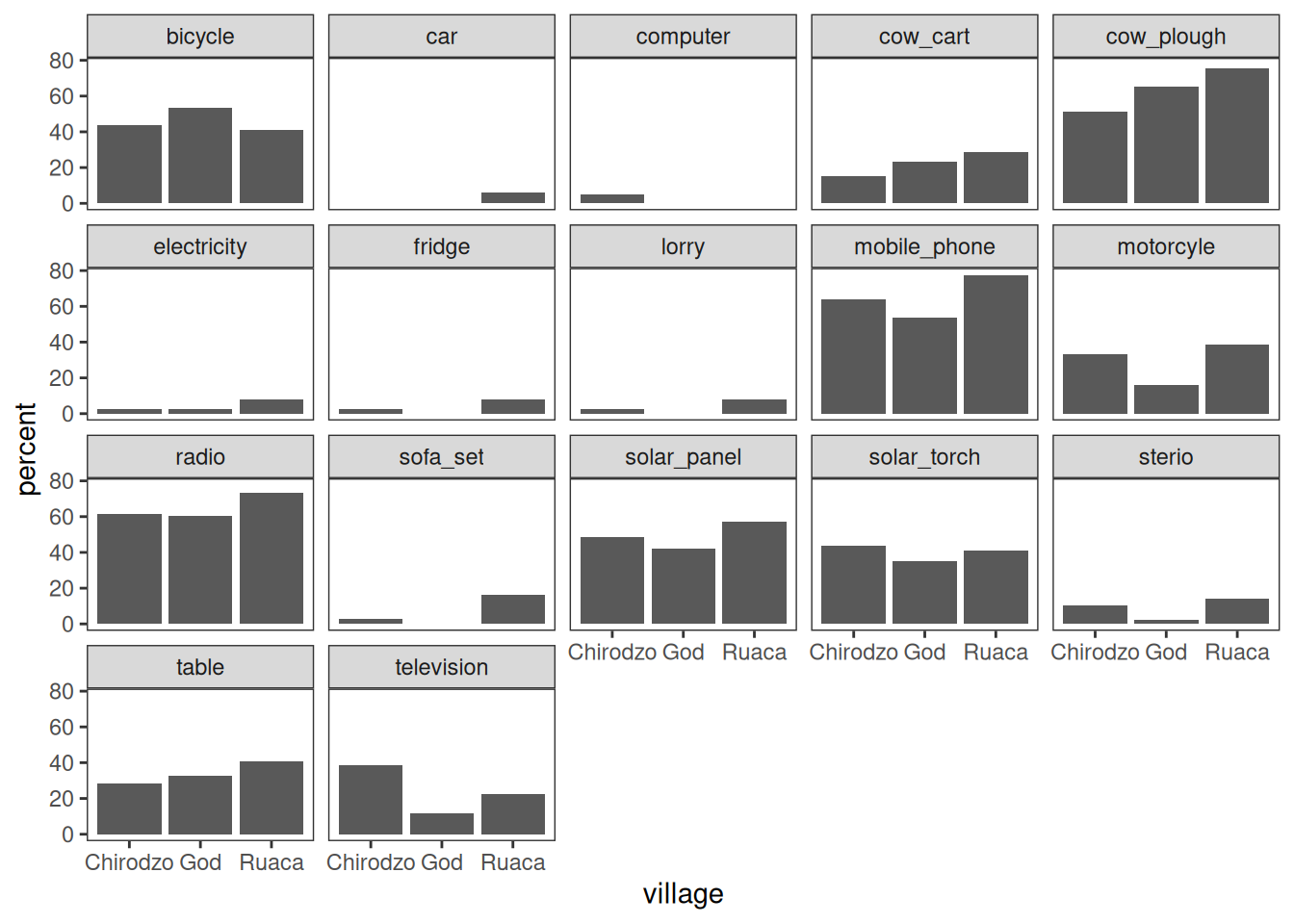
Note that the .names argument to summarize(across()) is specified as a
glue string that uses str_replace() to cut off the "owns_"
bit of the column names.
For more control, look into patchwork.
Stacked bar plots
Stacked bar plots are useful to show distributions of categorical variables. Here is a function that makes a stacked bar plot, with percentages on the x-axis, counts inside the bars, and a legend at the bottom.
It uses a bunch of techniques:
- The plot is complex, but because it is contained in a reusable function, it is easy to (re-)use.
- Category counts are computed, and added to factor labels, using
count_label(). - Cell counts are extracted and displayed inside the bars, using
after_stat().
#library(ggthemewur)

stacked_bar_plot <- function(df, by, fill) {
  # outputs a stacked bar chart

  df %>%
    # the category labels should include counts
    mutate( {{ by }} := count_label( {{ by }})) %>%
    ggplot(aes(y = {{ by }}, fill = {{ fill }})) +
    geom_bar(position = position_fill(reverse = TRUE)) +
    labs(x= "") +
    #theme_wur() +
    #scale_fill_wur_discrete() +
    geom_text(
      stat = "count",
      # for %: after_stat(scales::percent(count / sum(count),accuracy=1))
      aes(label = after_stat(count)),
      position = position_fill(vjust = 0.5, reverse = TRUE),
      color = "white"
    ) +
    scale_x_continuous(labels = scales::percent_format()) +
    theme(legend.position="bottom") +
    guides(
      fill = guide_legend(
        nrow = 1,
        title.position="top",
        title.hjust = 0.5
      )
    )
}

count_label <- function(vector) {
  # takes a vector of strings or factor,
  # output a factor vector with N = N included in the labels
  fct_recode(
    factor(vector),
    !!!vector %>%
      as_tibble() %>%
      group_by(value) %>%
      summarize(n = n()) %>%
      mutate(
        value = as.character(value),
        newlabel = paste0(value,"\nn=",n)
      ) %>%
    pull(value, name = newlabel)
  )

}


read_csv(here("data/SAFI_clean.csv"), na = "NULL") %>%
  stacked_bar_plot(village, respondent_wall_type)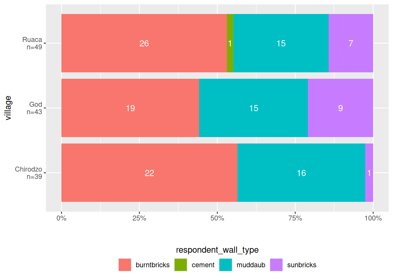
The point here is that plots can get quite complex, and by saving them in a function, you can reuse them easily.
Lollipop plot
A lollipop plot is a nice alternative to a bar chart. Here is an example.
It uses reorder to put the longest lollipops are at the top.
I also quite like theme_ipsum from hrbrthemes:
library(hrbrthemes)

N <- nrow(data)

read_csv(here("data/SAFI_clean.csv"), na = "NULL") %>%
    separate_longer_delim(items_owned, delim = ";") %>%
    select(items_owned) %>%
    filter(!is.na(items_owned)) %>%
    group_by(items_owned) %>%
    summarize(Count = n() / N) %>%
    mutate(items_owned = reorder(items_owned, Count)) %>%
    ggplot(aes(x = Count, y = items_owned)) +
    geom_linerange(
      aes(y = items_owned, xmin = 0, xmax = Count),
      color = "gray"
    ) +
    geom_point(
      aes(x = Count, y = items_owned),
      size = 4,
      position = position_dodge(width = 0.5),
      # color = brewur()[[1]]
    ) +
    theme_ipsum() +
    scale_x_continuous(labels = scales::percent_format()) +
    labs(
      title = "Look at this graph",
      subtitle = "People love radios, phones, and a good plough")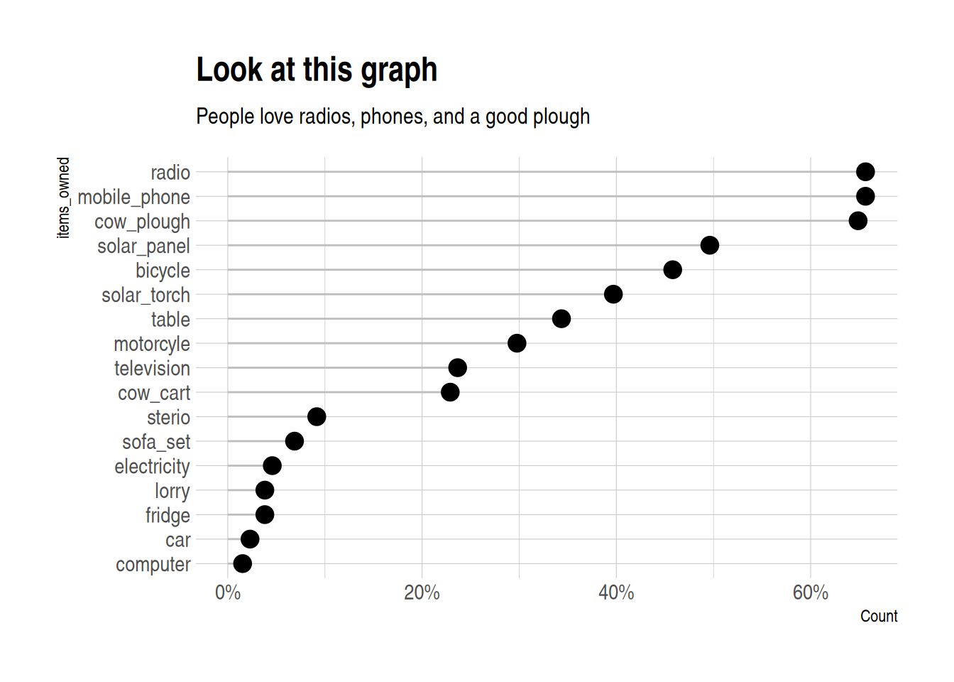
Maps
For maps, we use the sf package, and a sample data set, in geo-json format (but sf can use
all sorts of shapefiles).
I add some fake data to plot to the shapefile,
using familiar mutate() syntax:
library(sf)

file <- "https://raw.githubusercontent.com/johan/world.geo.json/master/countries.geo.json"


shapefile <-
  st_read(file) %>%
  mutate(x = rnorm(n = nrow(.)))
## Reading layer `countries.geo' from data source
## `https://raw.githubusercontent.com/johan/world.geo.json/master/countries.geo.json'
## using driver `GeoJSON'
## Simple feature collection with 180 features and 2 fields
## Geometry type: MULTIPOLYGON
## Dimension: XY
## Bounding box: xmin: -180 ymin: -85.60904 xmax: 180 ymax: 83.64513
## Geodetic CRS: WGS 84## Simple feature collection with 180 features and 3 fields
## Geometry type: MULTIPOLYGON
## Dimension: XY
## Bounding box: xmin: -180 ymin: -85.60904 xmax: 180 ymax: 83.64513
## Geodetic CRS: WGS 84
## First 10 features:
## id name geometry
## 1 AFG Afghanistan MULTIPOLYGON (((61.21082 35...
## 2 AGO Angola MULTIPOLYGON (((16.32653 -5...
## 3 ALB Albania MULTIPOLYGON (((20.59025 41...
## 4 ARE United Arab Emirates MULTIPOLYGON (((51.57952 24...
## 5 ARG Argentina MULTIPOLYGON (((-65.5 -55.2...
## 6 ARM Armenia MULTIPOLYGON (((43.58275 41...
## 7 ATA Antarctica MULTIPOLYGON (((-59.57209 -...
## 8 ATF French Southern and Antarctic Lands MULTIPOLYGON (((68.935 -48....
## 9 AUS Australia MULTIPOLYGON (((145.398 -40...
## 10 AUT Austria MULTIPOLYGON (((16.97967 48...
## x
## 1 -0.8874201
## 2 0.1054214
## 3 0.3528745
## 4 0.5503934
## 5 -1.1343310
## 6 1.4623515
## 7 0.7021167
## 8 2.5071111
## 9 -1.8900271
## 10 -0.5898128You can then use ggplot() and geom_sf() to make a map:
You can use the fill aesthetic to color your shapefile:
shapefile %>%
    ggplot(aes(fill = x)) +
        geom_sf(colour = NA) +  # removes borders
        theme_void()            # removes grid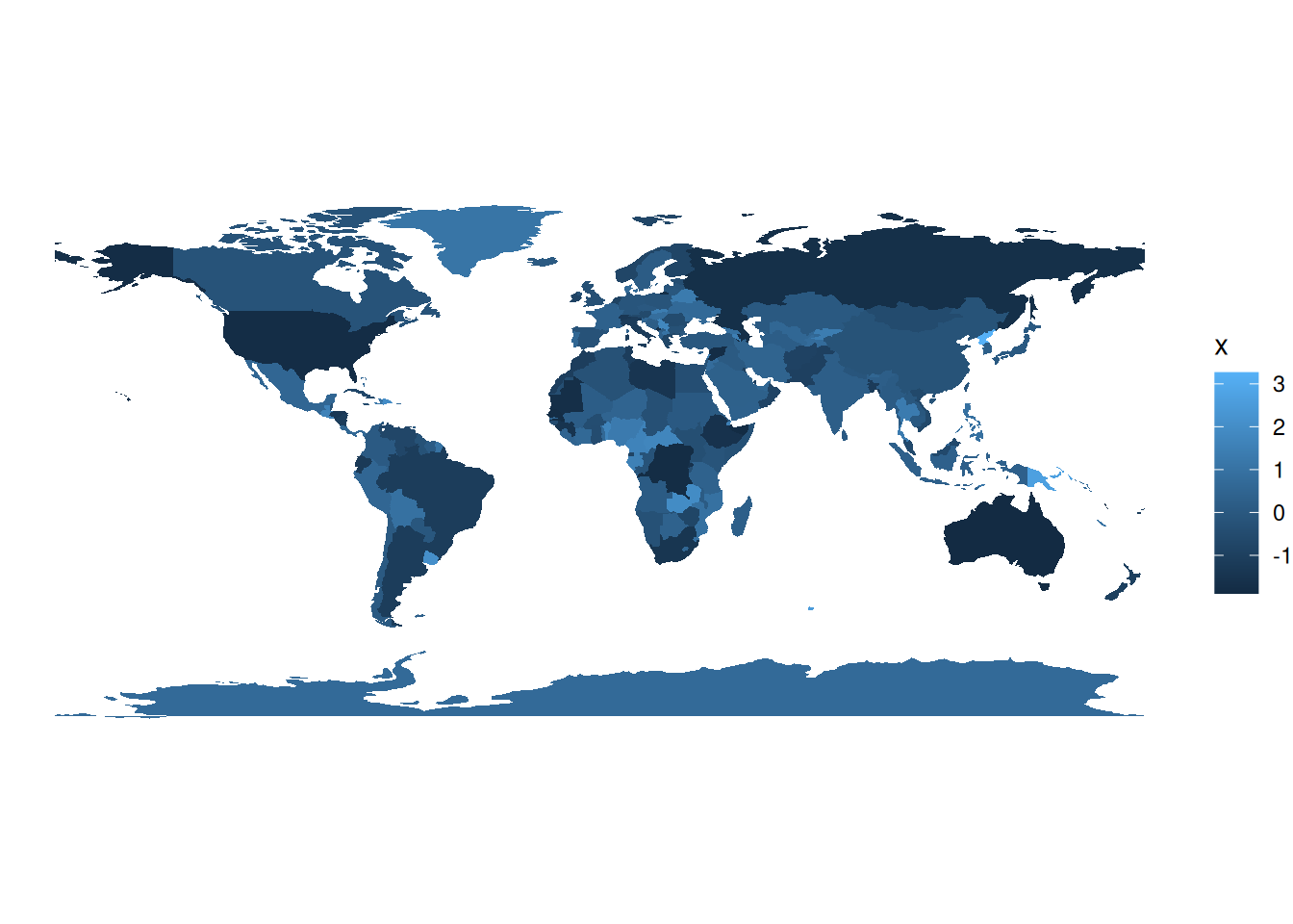
You can also make an interactive map,
which you can use in html documents created with rmarkdown,
or in shiny applications. It uses a palette I created using the colorBin() function.
library(leaflet)


pallete <- colorBin(
  palette = "YlOrBr", domain = shapefile$x,
  na.color = "transparent", bins = 5
)

shapefile %>%
    #mutate(x = rnorm(n = nrow(.))) %>%
    leaflet() %>%
    addTiles() %>%
    addPolygons(fillColor = ~pallete(x),
                stroke = TRUE,
                fillOpacity = 0.9,
                color = "white",
                weight = 0.3) %>%
    addLegend(pal = pallete, values = ~x, opacity = 0.9,
              title = "Look at these pretty colours", position = "bottomleft")